Intro to HCI Lecture 6 – Testing
These are my notes in essay form from the Intro to Human Computer Interaction course taught by Scott Klemmer at the University of California, San Diego.

These are my notes in essay form from the Intro to Human Computer Interaction course taught by Scott Klemmer at the University of California, San Diego. All credit for content goes to Scott, any errors are my own.
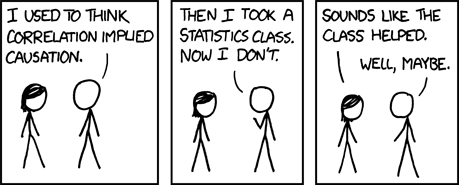
The next step in the process is to conduct tests on the actual usage of the application. Just like what we saw in the needfinding and interviewing process, simply asking people what they want will lead you to miss a lot of things. Questions like “do you like the interface?” tell you very little about how to improve your product. Even questions that appear to drive more specific results, such as rating the interface on a scale of one to ten, may appear to be more scientific, but is essentially the same question.
One reason that these questions are relatively unhelpful is because they are not very specific. There is often nothing to compare an interface to when asking that question, leaving the experimenter with a subjective answer.
There is also what is known as the “please the experimenter bias”, which is the effect of the tester doing their best to please the experimenter, which can be exacerbated when the experimenter is from a different social background, such as when white researchers conducted interviews in foreign countries like India.
Characteristics of Good Research Questions
As with user interviews and getting feedback, getting beyond “do you like my interface” means asking questions to that are specific and provide specific insights. Here are a couple characteristics of good questions.
- Baserates – Measuring a baserate generally involves measuring how often something happens, such as how many people click the first link on a search results page.
- Correlations – Measuring correlations means discovery connections between two separate events, such as measuring the correlation between when a class is offered and how many students attend.
- Causes – However, with any correlation, be aware that there can be multiple explanations. For whether or not students attend class, the correlation can be a function of when students want to go to class or when good professors want to teach.
Research Terms to Know
To fully understand the way that research is conducted, there are a couple of research terms to be aware of.
- Independent variables are variables that are independent of what the user does, because they are manipulated by the experimenter or application. In the example of the experiment of classes, the independent variable is the time the class is, because that is what the experimenter has control over.
- Dependent variables, on the other hand, are variables that the user has control of and that the experimenter is trying to measure. Common dependent variables include how long it takes for a user to complete a task, how many errors people make, how much a person remembers after an action, or emotional response.
- Internal validity determines how reliable an experiment is. If you were to run the experiment again, would you get similar results? Or, if you were to run the experiment with a greater number of people, would the results be similar?
- External validity is the generalizability of the results. Because internal validity may not apply in a real world situation, external validity determines how easily the results can be applied to other situations.
One of the common questions that designers want to ask is “is my cool new approach better than the industry standard?” After all, that is the reason why we are building something new. However, the problem with this question is that it is not a fair comparison. The industry standard is likely to have years of development and improvement as well as users that have adapted to the standard, while your product is likely a brand new one without too much development and familiarity. Consequently, asking if your approach is better than the industry standard can generate a response that is attributed to fidelity, approach, or a combination of both.
For example, one research study that came out when the iPhone was launched seeked to see if the touchscreen keyboard on the iPhone is better than physical qwerty keyboards or numeric keyboards.
“Research firm User Centric has released a study that tries to gauge how effective the iPhone’s unusual on-screen keyboard is. The goal is certainly a noble one, but I can’t say that the survey’s approach results in data that makes much sense.
User Centric brought in twenty owners of other phones — half who had ones with QWERTY keyboards, and half who had ordinary numeric phone keypads. None were familiar with the iPhone. The research involved having the test subjects enter six sample text messages with the phones they already had, and six with an iPhone.
Logical end result: These iPhone newbies took twice as long to enter text with an iPhone as they did with their own phones, and made lots more typos.”
Let’s break down this study to see why it was not a very good study. In this study, the independent variable, or the manipulation, was the input style. The measure, or metric for comparison, was words per minute.
In this study, all of the participants were new to iPhone keyboards, making them novices at the iPhone’s new style of keyboard, while being experts at the other type of keyboard they were already used to. While there is nothing wrong with testing beginners to see how fast people can learn a new keyboard, comparing their performance to a keyboard that they are used to is an intrinsically unfair comparison.
When the study was performed again on participants a month later, they found that iPhone users were about as fast as QWERTY users. This comparison is a more equivalent comparison than the first one.
However, when looking at the error rate of each type of input device, we find that iPhone users make more errors than the QWERTY or numeric keyboard users. Based on the nature of this study, this result can potentially be traced back to the fact that each keyboard type was used by a different group of users. Thus, there could have been significant differences in who each group of people were, making the variance in the user population still a problematic function if we want to draw conclusions about the overall performance of an input style.
Strategies for Fair Comparisons
Now that you’ve seen different ways that comparisons can be unfair, it is easier to recognize that an unfair comparison can lead to skewed results and inaccurate conclusions. Therefore, your job as a researcher is to make comparisons as fair as possible.
The first strategy for a fairer comparison is to insert your new approach into the actual production setting. By swapping out only the part of the approach that you are trying to change, you can easily see the difference that your approach makes. This may seem challenging, but you can use proxy servers or client side scripting to easily make this work.
The second strategy for a fairer comparison is to recreate the production approach in your new setting. Similar to the first strategy, this is another way to compare only the parts that you want to change into the production approach.
Another strategy that is used commonly in research is to scale things down so that you’re just looking at a piece of a larger system. Instead of building the entirety of the program, scaling things down to only the action that your change affects allows you to easily compare the differences.
Finally, when expertise is relevant, train people up. As we see in the study with the iPhone keyboards, people who were using the iPhone keyboards for the first time unsurprisingly performed worse than people who were using keyboards that they were familiar with.
The answer to whether interface x is better than interface y is most often “it depends”. Without defining what “better” means, it is impossible to quantitatively compare two interfaces. On the contrary, by properly understanding these characteristics of experiments, it allows you to make more accurate conclusions on the data that you collect.
In Person Experiments
While the web has made running experiments online extremely easy, there are also many benefits that come with watching people in person. By watching people live, you can talk to them about what they’re doing, hear their feedback, see points of confusion, and in general have a higher bandwidth of engagement.
When planning an in person experiment, the first step is to make clear goals and lay out the scope of the experiment, which will be guided by the purpose of the experiment, or what you hope to learn.
For example, if you’re building a room reservation system for a computer science department, one strategy would be to put all the information on one page, while another strategy may be putting information on multiple pages. You might be interested in seeing if splitting things up increases the likelihood of booking a room or not.
To conduct this experiment, we must consider a couple of factors. First, identify an appropriate setting for testing. If your software is most likely to be used in a quiet room, find a quiet room to do your testing. If your software is most likely to be used at a train station, conduct your experiment at a train station.
Next, figure out who you’re going to recruit, how, and how many people. Come up with realistic scenarios, ideally ones that participants can care about, to give people when they come in.
When it comes time for people to come in to test your product, have a list of questions and things that you want to pay attention to. In the case of our example, questions may include “Will people book the right sized room? For the right length of time?” or “How long did it take for the participant to book the room?” or “What other actions do people do while booking a room?”
If you can, it is helpful to have at least two experimenters present for the test. One person will be in charge of facilitating while the other takes notes.
During in person experiments, it is important to create concrete tasks for people to do, so that you have concrete data to compare, and everyone gets the same experience. In our example, a concrete task prompt might look something like:
“Book a room sometime next week for a research group meeting. Andrew will be out of town, so we won’t hear his weekly update. The rest of us should be present and give our updates. Besides the usual group members, we’ll have two visitors from France who will present their research — maybe they’ll take ten minutes each. When you’re done booking the room, tell Arvind so he can prepare the next task for you.”
As a side note, something to consider when performing in person experiments are ethical considerations. Some experiments have left participants in tears when they were unable to perform well. For starters, make consent voluntary, and make sure consent is informed, and allow participants to stop the study whenever they want. Perhaps the biggest clarification is to inform the user that you are testing the site, not the users. This helps users to understand that mistakes are the fault of the system instead of their own.
Another tip to create better experiments is to pilot your experimenting, letting one or two people go through the experiment before bringing in larger amounts of participants. This will help you work out any kinks in the flow of the experiment, the order of the experiment, and any other cases that may arise.
To best capture results from your experiment, the most simple and direct way is to take notes of things that went well, questions that arose, or problems to fix, one option is to record video. Be sure to collect both qualitative process data such as observations of what users are thinking and doing, as well as bottom-line quantitative data such as how many people succeed, how long it takes, etc.
Going beyond simple note taking, you may choose to record video. Recording video allows you to document and easily share exactly how and what the user felt as they go through the process.
Another consideration to capturing results is to determine whether you want participants to think aloud while they are going through the process. This allows you to record what the users are thinking, not just what they are doing. Since most people may not be used to sharing their thoughts out loud, you may need to prompt users along the way. Be aware that thinking out loud may also cause users behavior’s to change, and may not be an exact representation of what the user is thinking.
At the end of the experiment, it is helpful to debrief the participant so that they know what your goals were and so that you can learn more holistically what they are thinking after the experiment.
Online Experiments
The web has enabled tremendous power to conduct experiments online. This is accomplished by rolling out different versions of the user interface, getting feedback, and iterating quickly. You may have heard of this under many different names, likely A/B testing, split testing, randomized experiments, etc. The basic premise for this kind of testing is to randomly split traffic on your website to two or more versions of your interface, and then collect data on how the two versions perform.
As an example, the following are pages for the national alert registry, with three versions laid out below. The third interface, a two column layout, was designed to see whether it would generate more sign ups because the content is available above the fold.
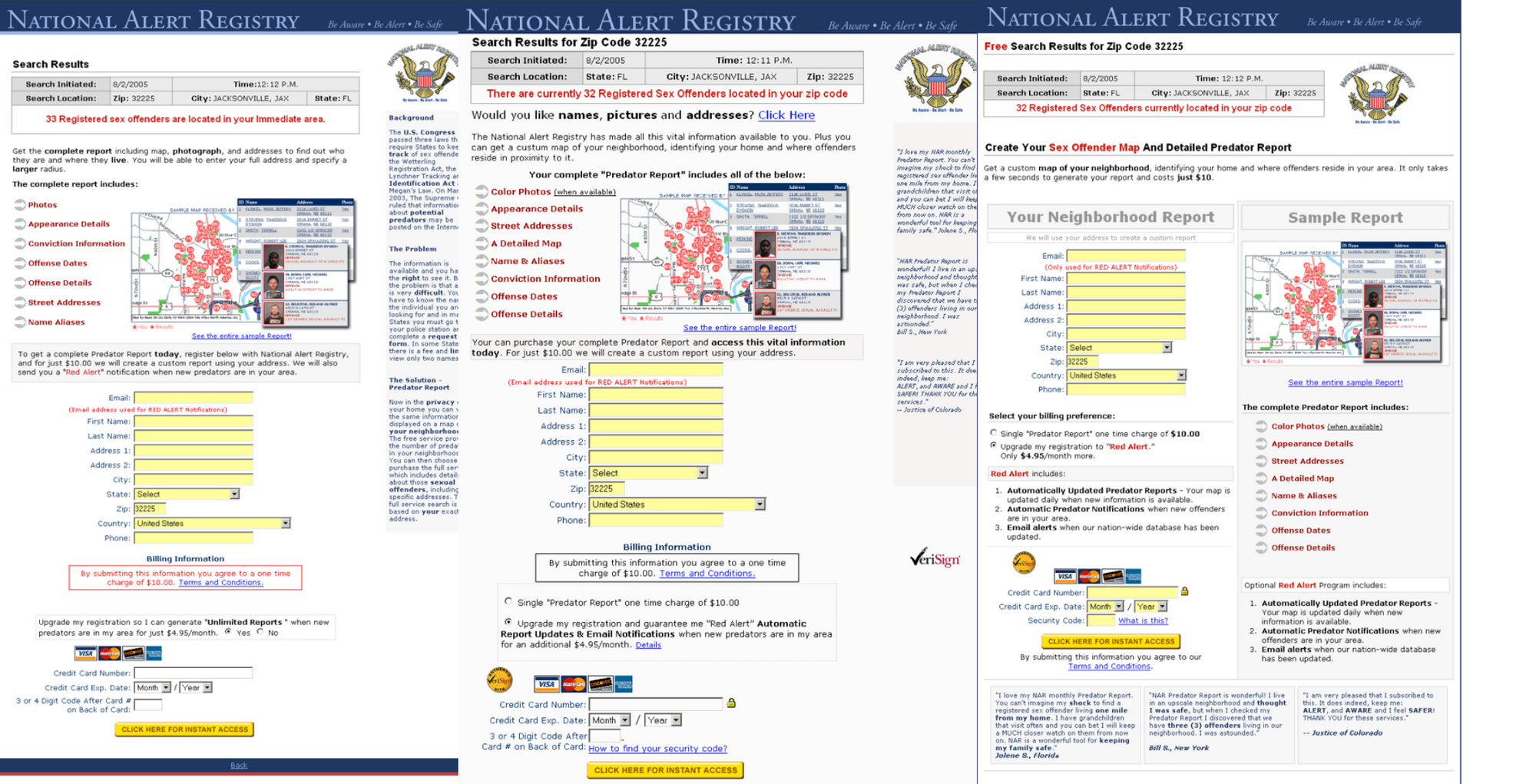
Before scrolling down to see the results, think about which version of these three user interfaces you think was the most effective.
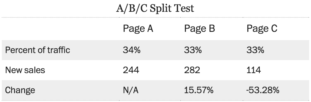
What you can see from the data is that the third version actually performed worse than the first two. Although it was intended to be more effective, the number of sales actually dropped tremendously. Even the very best designers often make a revision that performs worse than the original. The web allows us to easily try out these designs and get real feedback on how the designs perform.
So why did the third version do so much worse? One theory is the word free at the top left of the screen, that can dissuade people from buying something. Another theory is that by creating two columns, there is less of a clear flow, creating a perception of multiple options instead of a clear funnel that you want people to go through. By contrast, the second version did not have the word free at the top, and had a stronger call to action.
Therefore, we can see from this example that small changes can have a big effect on the performance of a site. These changes can include things like the position and color of the primary call to action, position of testimonials on the page, whether linked elements are in text or images, the amount of white space on a page, the position and prominence of the main heading, the number of columns on the page, number of visual elements competing for attention, the age, sex, and appearance of someone in a photo, etc. See the visual design lecture for more details on how to create good visual design.
Another example is Obama’s presidential campaign in 2008. Dan Siroker of the Obama campaign, shares how he used simple A/B tests on the button as well as the media to increase the performance of the Obama’s campaign site.
In the experiment with the text on the buttons, the only thing that changed between versions is the text on the button. The four choices were “Sign Up”, “Learn More”, “Join Us Now”, and “Sign Up Now”. Turns out, “Learn More” performed 18% better than the baseline.
The second experiment, the media on the page, was split between three photos and three videos. The strongest media, contrary to what most people would have guessed, was the family photo.
From these examples, there are a couple of general principles that contribute to a quality online experiments.
Firstly, when running online experiments, it is most helpful to run experiments at 50/50%. While some people recommend starting a small percentage of users with the new design, this is not as helpful for being able to quickly tell which interface performs better. By setting it at 50/50, the better interface is blatantly apparent. However, to prevent disastrous results, ramping up to 50% is the best course of action. Ramping up will help avoid software bugs or other unforeseen effects affecting users from performing the task.
There are some key rules for random assignment. The first is that your assignment should be consistent. The same person should see the same interface every single time they use your interface. The second key rule is that your assignment should be truly and completely random. This means that you want to run different versions simultaneously, and that the probability someone has of using one version of the interface is the same as using the another version.
The hardest part about online experimentation is picking the metric to measure a good interface by. One common mistake when picking metrics is picking a metric that is easy to measure instead of a metric that accurately reflects success. Thus, it is important to pick a metric that matters over picking a metric that is easy to measure.
Additionally, it is also important to run online experiments for long enough. Just like users testing the new iPhone keyboard, if you change a user interface, people may not be used to it, generating poorer initial results.
Finally, no matter how long or diligently you conduct your experiments, larger theories are still difficult to prove. Even with large sets of data, the variance and changes can be due to a larger, unseen reason. Thus, it is important to constantly ask different questions and run multiple types of experiments to identify trends on how interfaces perform rather than all encompassing claims one way or the other.
Interpreting Test Results
After you’ve done your tests, whether in person or online, it is important to properly analyze the data so that you reach accurate conclusions. A good starting point is asking yourself the questions “What does my data look like?”, “What are the overall numbers?” and “Are the differences real?”
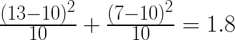
For instance, say I have a coin and I want to test to see whether the coin is a fair coin or not. To test the coin for fairness, let’s say that I flip it 20 times and 13 of the flips came up heads. Despite the fact that the result of 13 heads is not equal to the expected number of heads, we need to determine if 3 additional heads out of 20 is a significant difference.
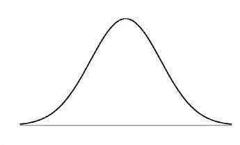
Since the results of flipping a coin lies on a gaussian distribution, that is that the further away the outcome is from the mean, the less likely it is to occur, we know that flipping 11 heads on a fair coin out of 20 flips is more likely than flipping 19 heads out of 20 flips.
To determine the significance of the difference, we are going to use the Pearson’s Chi-Squared Test. This test is a way to compare the expected rates to the experimental rates to determine a percentage of confidence toward a conclusion.
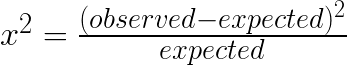
To accurately determine whether we can reject the null hypothesis, or the default hypothesis that the coin is a fair coin, we need a threshold p-value, most often 0.05, to compare with the result of the chi-squared test.
Therefore, if 20 flips of a coin resulted in 13 heads and we have a p-value less than 0.05, we have:
(heads + tails = chi-squared value)
Based on our calculation and the p-value distribution table, we can see that our results are not quite at the p < 0.05 threshold, meaning that we cannot sufficiently reject our null hypothesis and say that the coin is biased.
However, if we flipped the coin 60 times and resulted in 39 heads, the same ratio as the previous experiment, running those numbers through the chi-squared distribution allows us to reject the null hypothesis with 98% certainty. This is because more trials brings our chi-squared value up.
Chi-Squared testing is valuable because it doesn’t just apply to coins, but also applies to click through rates on websites. Let’s say that a website has a button labeled “sign up”, and 10% of visitors click the button. To try to improve traffic, designers change the button to “learn more”, and start gathering data. Over a week, there were 1000 visitors to the site, 118 of which clicked the “learn more” button. Running this data through the formula gives us the follow chi-squared value:
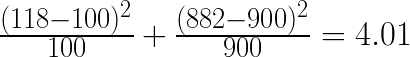
In looking up this data in our table, we find that 4.01 generates a p-value that is just smaller than 0.05, allowing us to formally say that the change was an improvement.
Thus, statistical testing gives you two very powerful tools. First, it allows you to formalize “we’re pretty sure”, using statistics to validate your claim. Secondly, it helps you generalize (or not) from small sample sizes. There are also other tests that achieve a similar purpose for continuous data such as T-tests and ANOVA.
Also, note that data often isn’t “normal”. Data doesn’t always lie on a gaussian distribution, as it can be bimodal or weighted one way, making statistical analysis potential complex.