Intro to HCI Lecture 5 – Visual Design
These are my notes in essay form from the Intro to Human Computer Interaction course taught by Scott Klemmer at the University of California, San Diego.
These are my notes in essay form from the Intro to Human Computer Interaction course taught by Scott Klemmer at the University of California, San Diego. All credit for content goes to Scott, any errors are my own.
After you’ve developed how your interface works, you reach a point in which it is time to focus on higher fidelity aspects of the interface, namely the design of your interface and how it looks. Visual design is fundamentally about making contrast. Whether contrast is done via size, color, or other contrasting elements, creating contrast allows you to indicate the hierarchy of the elements.
“Information consists of differences that make a difference” – Edward Tufte
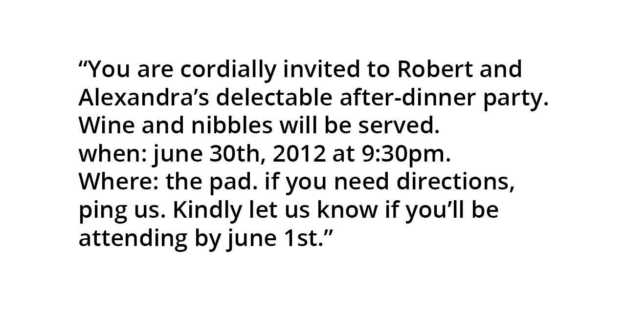
Let’s look through a process in converting the following block of text into something a little bit more well-designed.
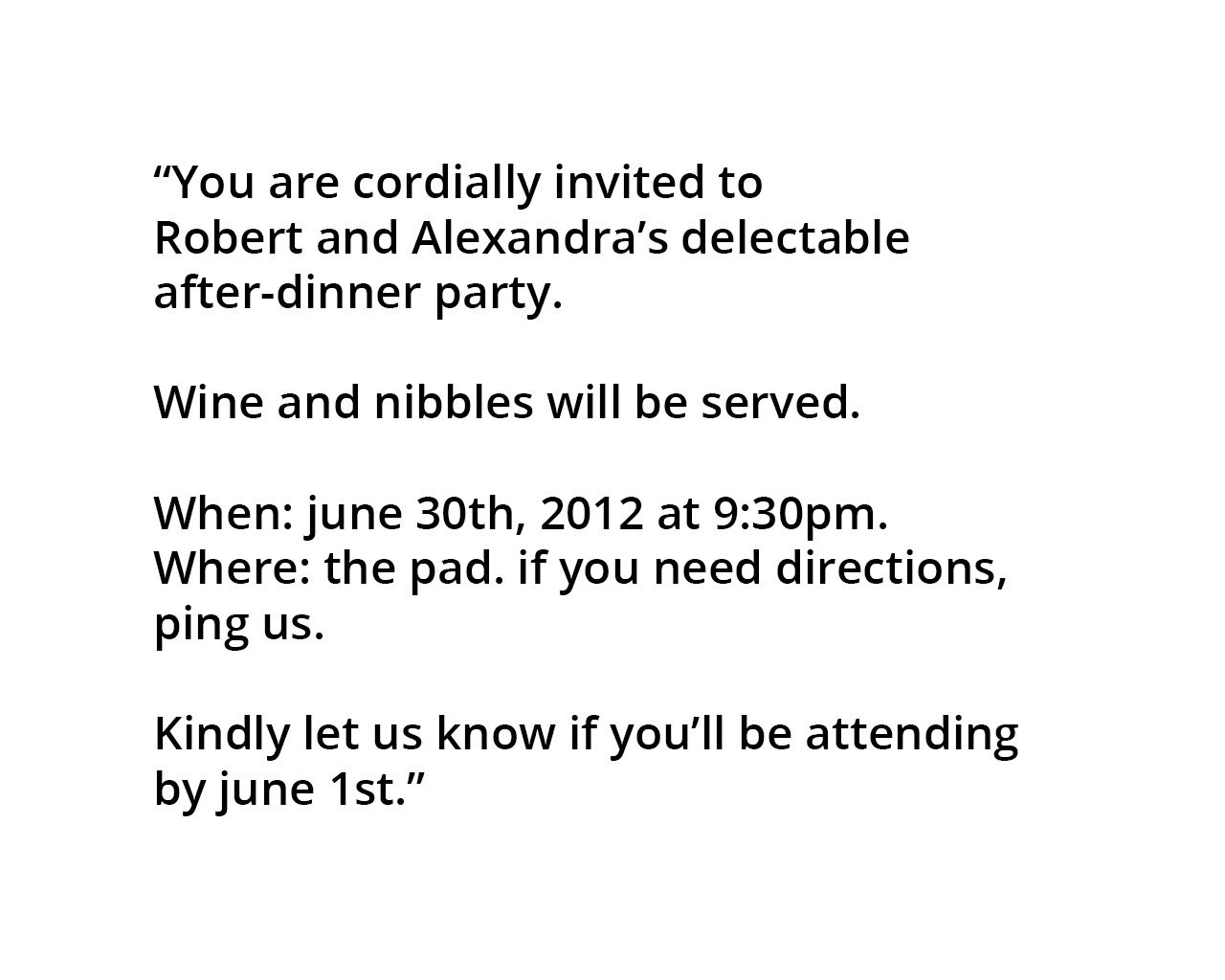
The first thing that we can do is to add some white space. Since white space conveys grouping, simply adding some space between lines helps break up the text into a more readable snippet.
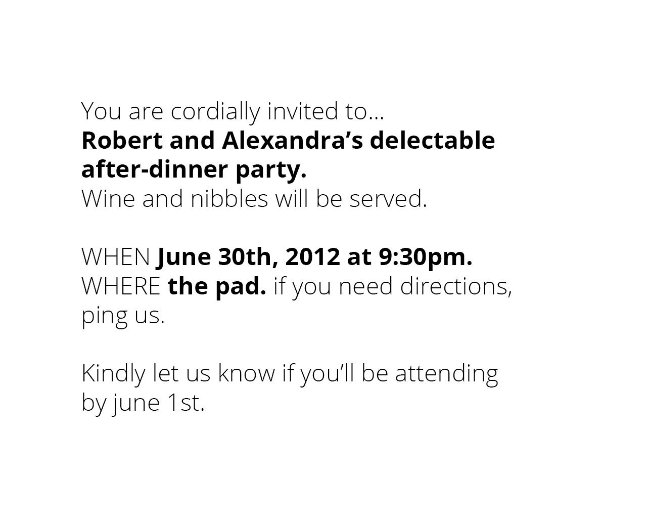
Next, we can use size and weight contrasts to indicate hierarchy. We can use this idea to edit the invitation to look something like this:
Good design, like good acting, often goes unnoticed because the content comes through extremely clear. However, sometimes we do notice good design or good acting for it’s specific flavor or ability convey a certain thought or idea. Bad design, on the other hand, is apparent in a different way than good design is. Bad design is noticed when it is tripped over, causes problems, or otherwise sticks out.
Recognizing Visual Hierarchy
Thus, to do visual design well, there are three main goals. The first goal is to guide the eye to where attention should be given. This means conveying structure, relative importance, and relationships between different information. The second goal is to pace. This means how the design draws people in, orients them, and provides areas and ways for them to dive deep. And lastly the message, which expresses the meaning and style, breathing life into the content.
To illustrate, let’s compare four different home pages and how they each use visual design to achieve their goals.
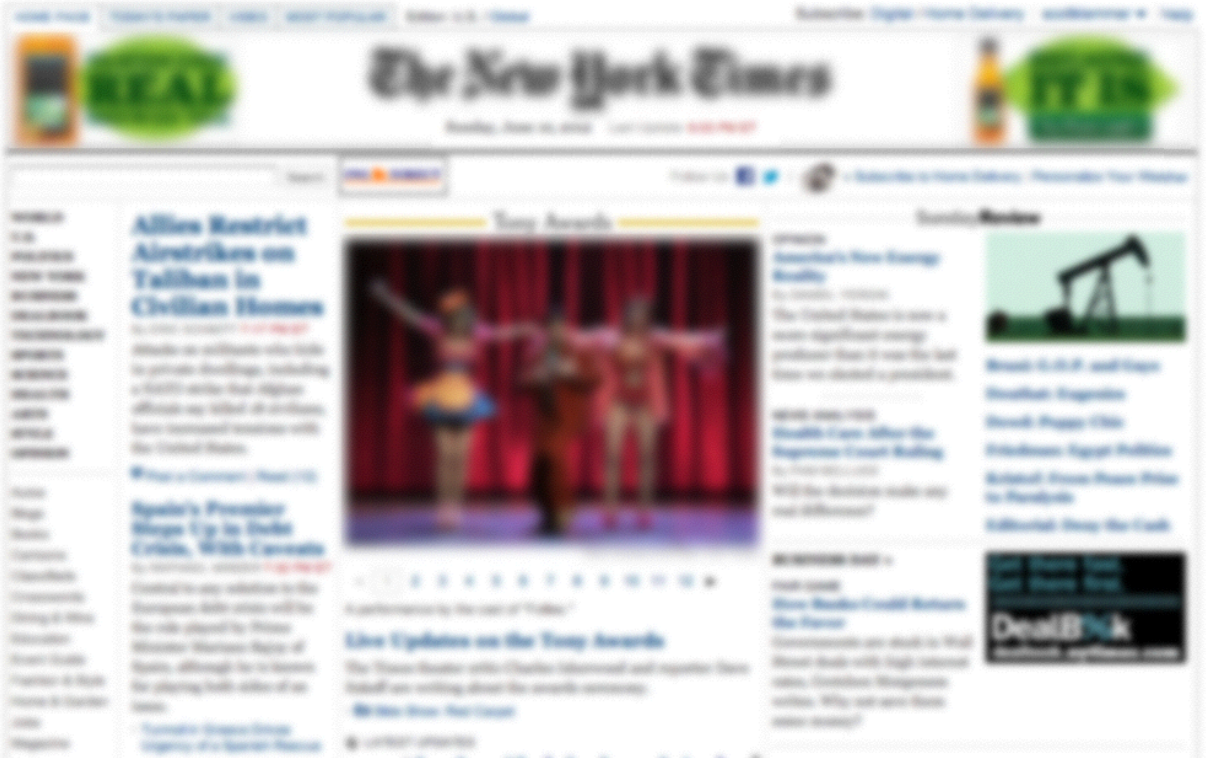
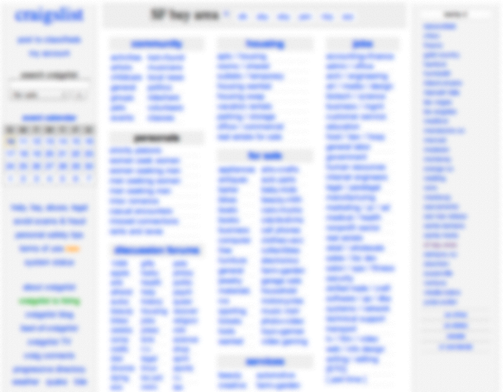
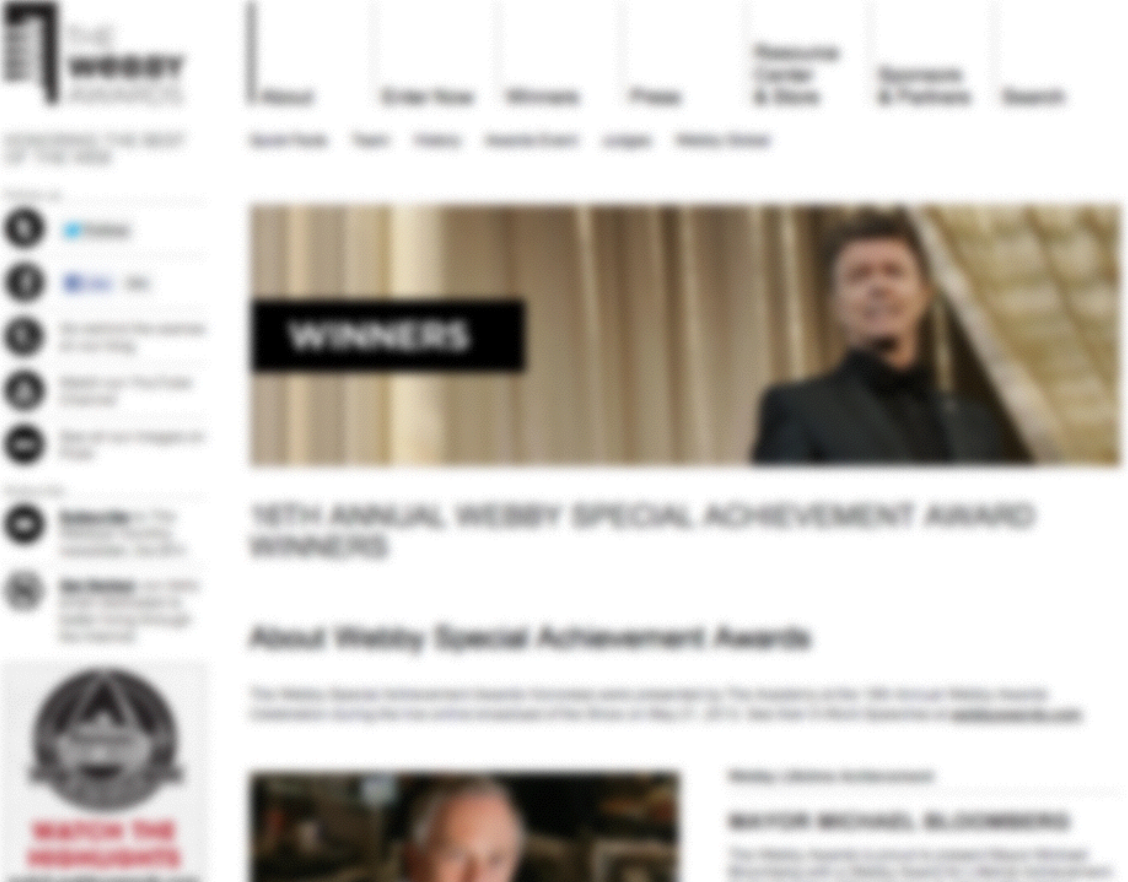
One strategy for making visual hierarchy extremely apparent is to simply blur the page. By doing this, we are able to recognize which parts of the page stick out more strongly than others.
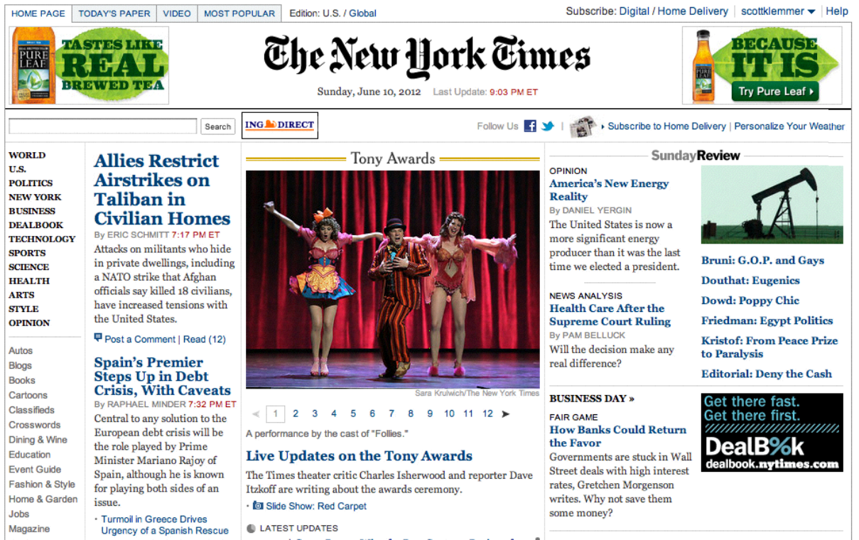
New York Times does a good job of indicating visual hierarchy as you can tell from the blurred photo. It is clear that the title is on the top, some sort of cover story occupies the center, and other content is displayed to the left and right of the cover photo. The readers eyes are easily attracted to the center of the page, where they can find the main story.
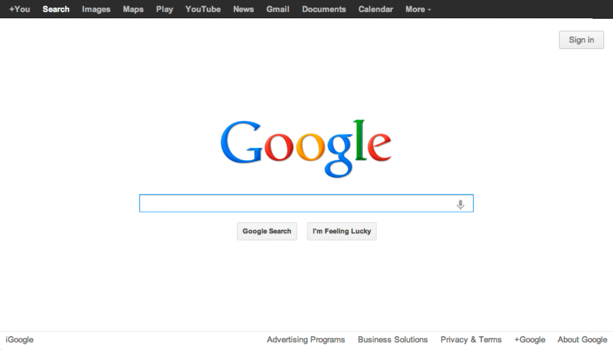
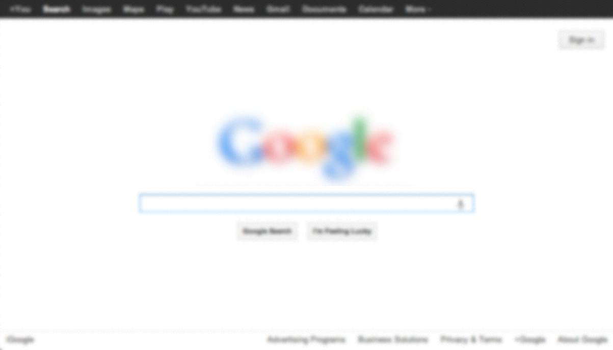
The Google homepage is another example of a website that uses a very minimal visual design to guide the eye and orient the user. Even when the homepage is blurred, the colors of the logo are still highly visible, making it extremely easy to recognize. The usage of the search box helps the user to recognize the main functionality offered by the page.
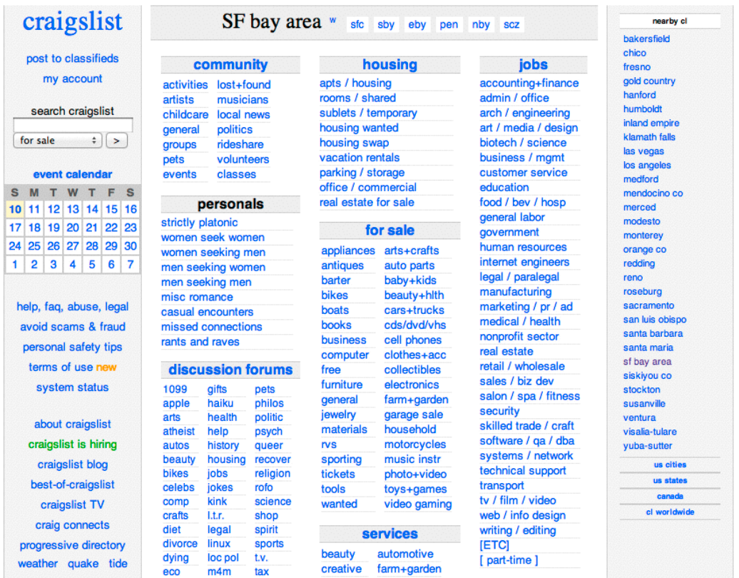
Although most people would not consider Craigslist a well-designed website, it actually conveys the information hierarchy quite well when blurred, and is a nicely functional design for the goals they are trying to achieve. From the blurred image, we can see the sidebar on the left and recognize the categories and sections of classifieds on the main body of the page.
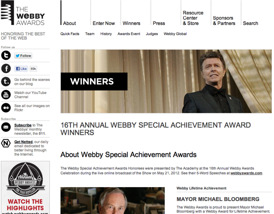
The Webby Awards is another example to consider. As you can see in this example, color is used very sparingly and effectively to engage the user into the content. From this blurred image, we can easily distinguish the sidebar and header, as well as the content of the page.
Now that you’ve learned how to recognize visual hierarchy, the next step is to learn the different tactics and strategies for creating different levels of visual hierarchy. When it comes to creating visual hierarchy, there are three main aspects of your design to manipulate: typography, layout, and color.
Typography
Typography has huge effects on how people see and interact with your content. Type, although often invisible to most people, has an enormous effect on how your content is communicated.
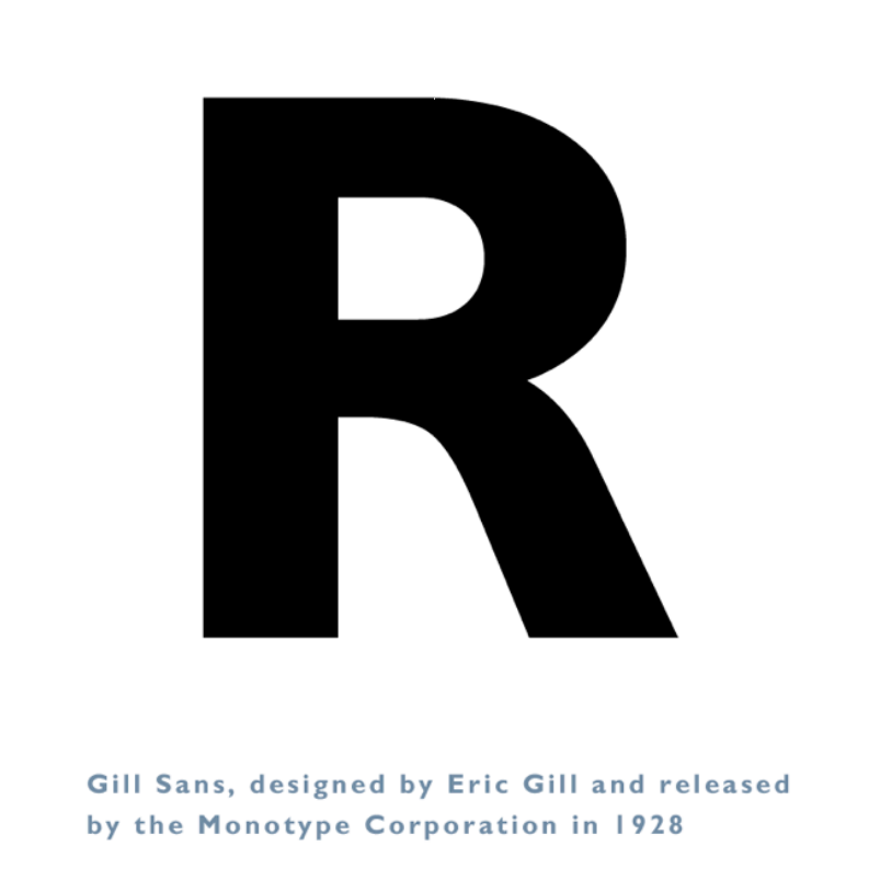
For example, consider the letter “R” as done in Gill Sans. In this letterform, there is a perception that the weight of the letter is uniform throughout. However, when examined closely, there is a difference in the weights at different parts of the letter. If you look at the bottom of the letter, you see a different thickness than in other parts of the letter. This is an example that shows that in graphic design, it is important to design things to be perceptually balanced and perceptually uniform.
Typography can be done with a large variety of different attributes to create a virtually endless number of possibilities and combinations. Here are six typographic terms to know:
Point Size
The point size of the font is simply the size of the font on the page. Note that although point sizes specify the height of the font in points, a 12 point size in one font will not always be exactly identical to 12 points in another font.

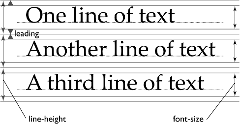
Leading
Leading refers to the height of the line, with greater leading meaning greater space between each line of the content. It’s customary to have 20% of your font size as your leading.
X-height
The height of the the lowercase letters is known as the x-height of the font, which has an effect on the readability of the font. In general, fonts with greater x-heights are easier to read at small font sizes than fonts with smaller x-heights.
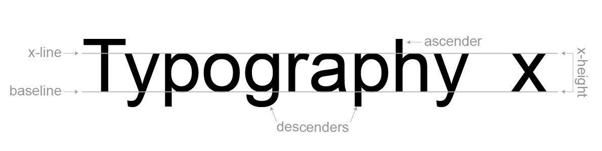
Ascenders and Descenders
These are the parts of the letters that extend above or below the lines of the font, such as the part of the letter “y” that extends below the bottom, or the part of the letter “l” that extends above the top.
Weight
The weight of a font refers to the thickness of the letters, and can range from thin or light to bold and heavy. The weight of a font also can provide a good contrast to what the content is trying to convey.

Serifs
Fonts can be divided into two main categories: serif fonts and sans-serif fonts. Serif fonts are the ones with the little serifs coming out of the edges of the font, giving it a more traditional look, while sans-serifs don’t have these additional markings, making them look more modern. Historically, serif fonts are considered easier to read, even though there’s no way to quantitatively prove that statement.
Ultimately, picking a typeface depends primarily on application of the content being used. When choosing a font for a logo, the font should be something that stands out, is clear, and makes a statement. But when choosing a font for a book, the font should be chosen to maximize readability of the content.
To become more familiar with typefaces and how they look, try using a typefaces in multiple places to see the range of places that the typeface does well in, or try displaying the same text using different typefaces to see how the text changes meaning.
Layout
The next tool for creating a visual hierarchy that is clear and distinguishable is to consider the layout of your content. By grouping things and putting them on a grid, we can visually guide the user into a design.
The first example of a grid comes from the Java grid systems. As you can see, all of the elements in this dialog box have been arranged in a grid, or a set of invisible lines that all elements in the dialog box snap to.
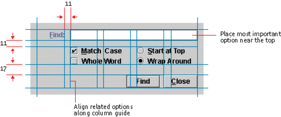
Notice how the “find” and “close” buttons align to the right of the grid, while the checkboxes have their own spacing that lines up with the search box up at the top. And to draw more attention to the search box at the top, the “find” label hangs off the left of the search box, making it more noticeable to the user. Also notice how related things are grouped closer to each other, such as how the checkboxes that parameterize the search query are closer to each other than they are to either the search box or the action buttons.
As popularized by Jan Tschichold, grids comprise of columns that contain the content, and gutters that act as the spacing between columns. Additionally, things are generally horizontally aligned using a baseline.
Consider Myspace’s homepage for example. Myspace uses a grid system that separates out the content in a easy to navigate manner.

However, layouts can also utilize content boxes that span across multiple columns, making the content a little bit more dynamic to users. For example, the New York Times homepage utilizes elements in the center that span across two columns, making the content in the center more focused and attention grabbing.
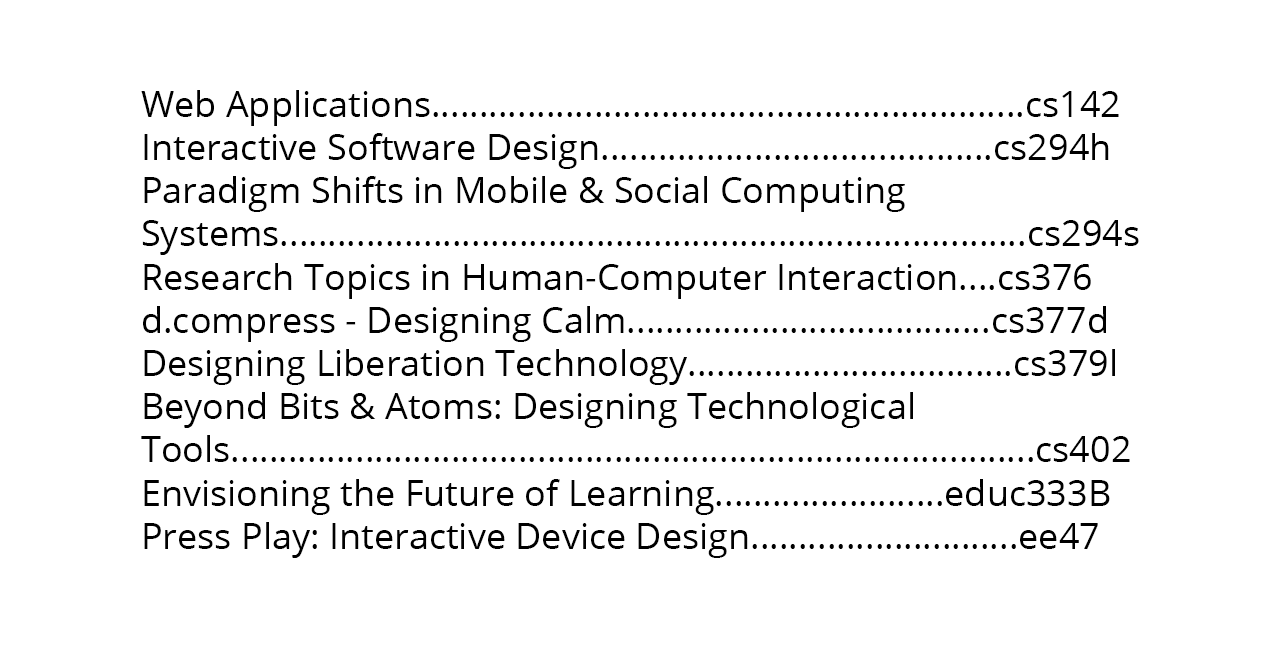
Consider the table of contents of a book as another example of the difference a good layout can make. One layout of the contents that you are likely familiar with is spacing content out with periods or spaces, like we see in this example.
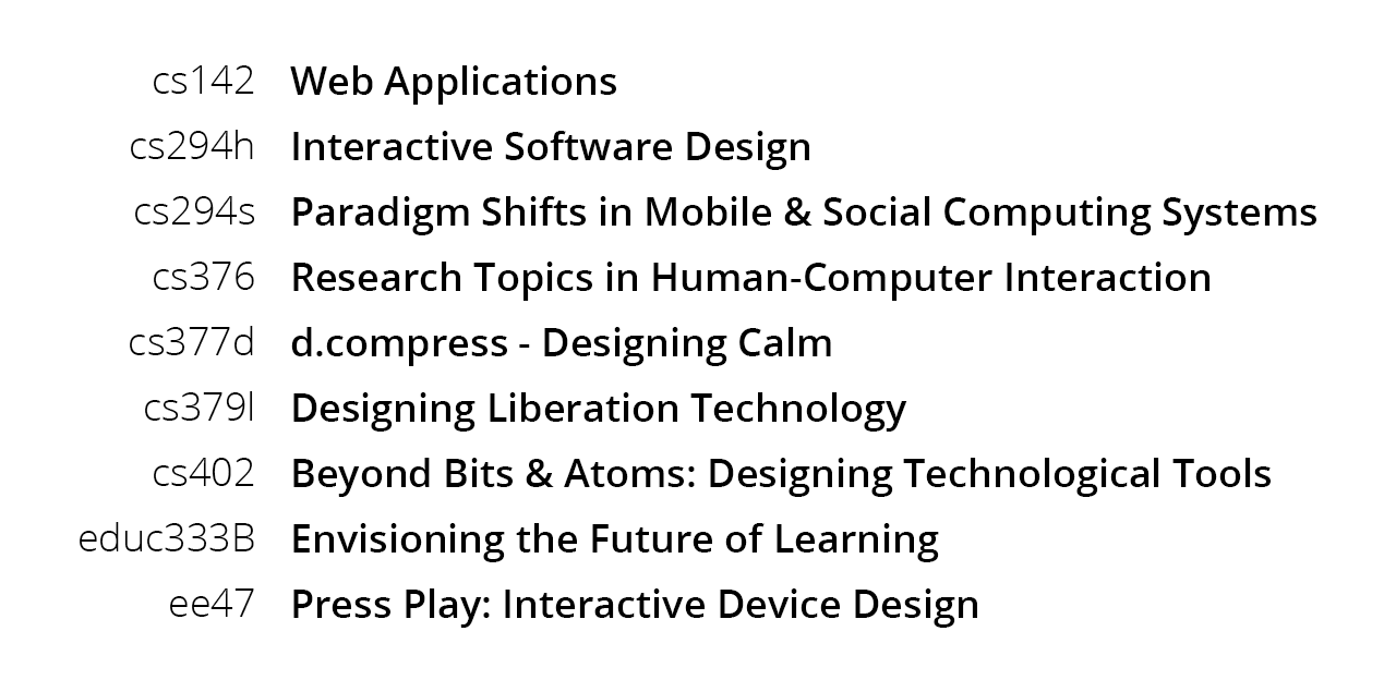
However, by simply moving things around a little bit and applying some typographic variation, we can improve this layout dramatically. By putting the course titles in a smaller column that is right aligned with the course names in a larger, left aligned column, we can provide a much clearer layout of the information.
One quick tip when designing templates is to design for the longest block of text. Especially when building in a grid, it can be easy for the design to break down if the length of the title is too long. Also keep in mind that languages like german tend to take up more spaces than english, spanish, or french.
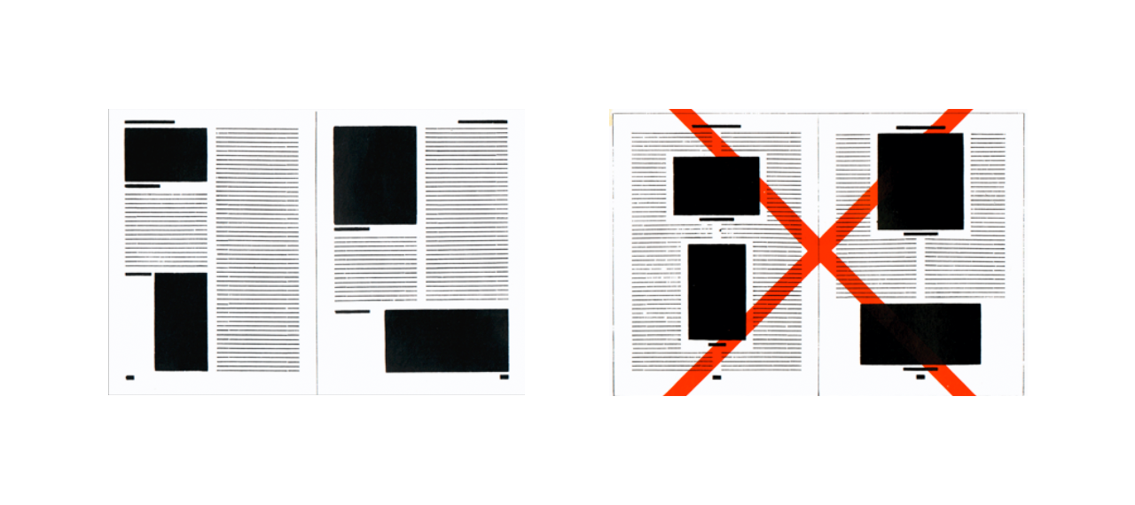
Properly aligning content guides the eye and reduces clutter. Avoid slight misalignments, because any misalignment is easily noticeable and undermine your ability to beacon organization. Thus, when you deviate from a pattern, do so strategically.
When designing interfaces, to determine whether you should left, center, or right align content requires an understanding of what your content is. For example, Amazon forms use right aligned labels with left aligned input fields so that there is a clear gutter down the middle of the form. This makes what you need to fill out extremely clear.

In general, aligning things to edges gives the content more energy than if you were to align things to the center. Known as asymmetric typography, laying out blocks on pages with left and right alignments are more constructive, meaningful, and economical.
Color
The last tool to utilize when working on a visual design is color. As seen in the examples above, many websites use colors very sparingly in order to accent different parts of the interface, making a consistent color scheme across the entirety of the application. In fact, the best designs often only use a couple of colors.
In fact, it is usually helpful to design in grayscale first, using layouts and typography as the main methods of creating visual hierarchy, and adding color to strengthen and highlight other elements. Then, when moving from grayscale to color, be sure to keep the luminance values of the grayscale mockup that you created.
Reading and Navigating
Because people routinely and regularly consume information, the famous psychologist George Miller called people “informavores”. Like foragers who try to gather lots of food very quickly, informavores attempt to gather lots of information very quickly.
One of the major attributes of how people find and gather information is known as information scent. As we browse the internet, the information scent refers to the cues that people use to get to the information that they want. We use these cues to figure out where we are, if information is trustworthy, as well as what options are available.
If you have a website and want to know if the scent is poor on your page, there are a couple tell-tale signs that people are having trouble finding what they are looking for.
The first indicator as you watch a user use your interface is flailing. If a user goes back and forth and flail around when they go to a particular page, it often means that they have no idea where to go.
Another indicator of a low scent is low confidence. If a user is unsure whether a link will take them to what they are looking for, that is also an indicator that the interface should be improved. Pay attention to their confidence levels before and after they click the link. If they are confident prior to clicking the link but unsure after, it means that the user believed the link would give them information that they didn’t actually get. If they are not confident when clicking the link, it means that the link is not clear enough to give the user confidence in what they are going to see.
The last sign to pay attention to is how often a user uses the back button. Frequent uses of the back button is also an indication that users are having difficulty finding what they are looking for.
One example of a low scent interface is the navigation for the Stanford credit union. As you can see, the items on the navigation are short and full of jargon that is unique to this navigation, making it difficult to know where to find the pages you are looking for. Additionally, the second level navigation that appears after hovering over an entry makes it even more difficult to find the right page, often requiring multiple attempts.
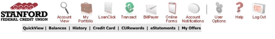
Additionally, generic icons rarely help the user navigate through the interface. Icons are only helpful when the facilitate repeat recognition in different parts or repeat uses of the application, when users know what something looks like but not what it’s called like in a foreign language, or for redundant coding when you can recognize either the icon or the label that accompanies the icon.
Another thing to know about how people navigate pages comes from a study done with eyetrackers. The study revealed that most people tend to view the upper left hand corners of pages, as can be seen in this heatmap.
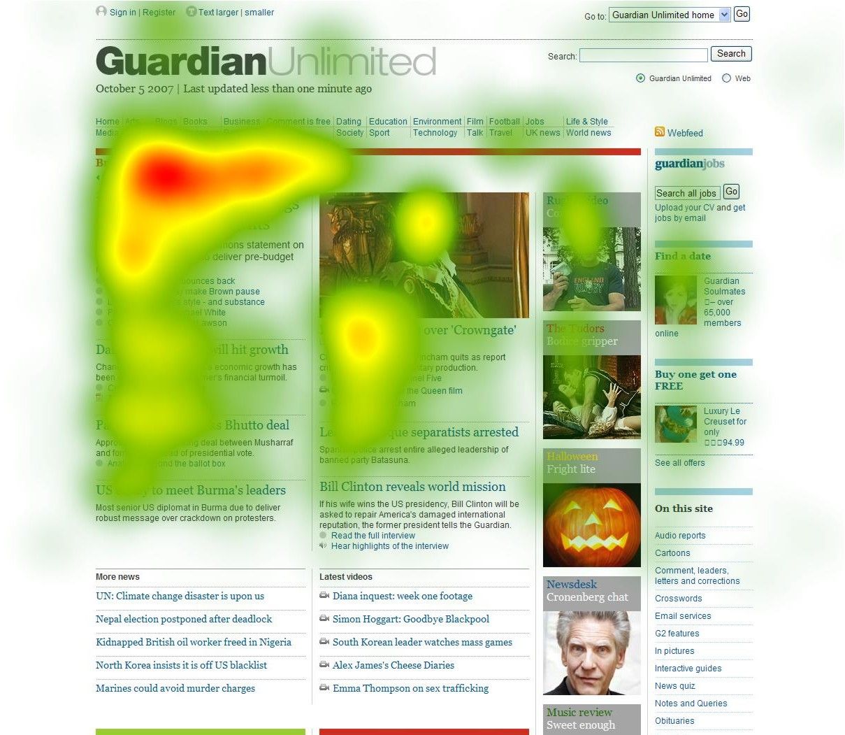
Using these insights, we can design for glanceability. Since most users instinctively start at the top left, it is generally better practice to put key information in that area of the page. And while this is a good heuristic, these trends are going to be genre specific as well as unique to what the user is expecting.
Therefore, the most important information is going to be above the fold where people expect it to be. The content that is above the fold gives users a sense for what is below, and users are generally happy to scroll if they find the content above the fold to be engaging and interesting content.
In another study conducted by Jakob Nielsen on how people read online, the short summary is that they don’t. This study isn’t referring to long articles that people read, but when they are surfing the web in a more general manner. What Nielsen found is that people often have multiple tabs open and performing what is known as “interlaced browsing”.
Thus, the best sites are the ones that support this interlaced browsing as best as possible by bringing the most important content to the top, using clearer language, and using visual contrasts in the content such as bulleted lists and headings.
Further Resources
- The Elements of Typographic Style – Robert Bringhurst
- Designing Interfaces – Jenifer Tidwell
- Envisioning Information – Edward Tufte
- The Non-Designer’s Design Book – Robin Williams
- Helvetica – Gary Hustwit
- The New Typography – Jan Tschichold
- Designing Visual Interfaces – Kevin Mullet and Darrell Sano
- Web Form Design – Luke Wroblewski
- Designing for the Scent of Information
- Information Foraging Theory – Peter Pirolli
- Alertbox – Jakob Nielsen