How the Washington Post Covered the 2024 Elections
Publishing over 650 live results pages, the 2024 election was the most ambitious election night coverage the Washington Post has executed to date.
Building a live elections results tracker is like building a race car for a race. You don’t get to pick when the race is, you have no way to postpone the race if challenges arise, you have to follow the rules of the race committee, and you spend years building a system or machine that only runs for a couple of hours or days. And if something goes wrong, every second you spend fixing a problem is a second you lose off the clock. But if successful, you bring in money for your sponsors, recognition for your brand, and even influence consumer spending decisions. It’s a completely different workflow compared to building a typical production software application that adheres to a regular cadence of testing and release cycles. Everything needs to be built with performance, rapid recovery, simplicity, and flexibility in mind, and thoroughly tested against all sorts of edge cases and hypothetical scenarios.
At the Washington Post, that is the level of energy, focus, and determination we put into building the system we used to cover the 2024 election cycle, which had no shortage of twists and turns. In 2023, we set out with a plan to make our 2024 elections coverage the most ambitious, most product oriented, and most technologically challenging live elections results coverage any news organization has ever undertaken.
A page for every race
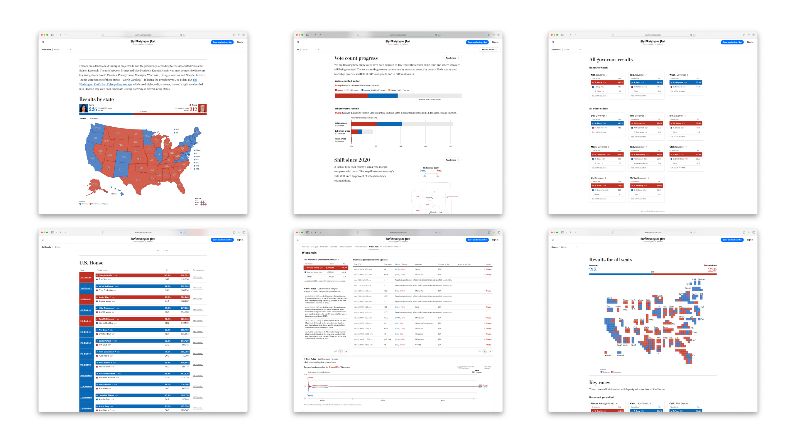
On November 5th alone, we published over 650 election results pages for the general election and live election results components all over the web and mobile apps. This is an order of magnitude more than any live elections coverage the Post has done in the past in order to rank on search engines no matter what election a user searched for. This meant that we needed to rebuild much of our technology stack in order to support such a large number of pages with live updating elections results. On top of that, we also published live election components such as maps, tables, and graphs to our homepage as well as the live activity feeds. Our bets paid off, as we reached over 9.5 million unique pageviews over the course of the night and into the next day. The election results infrastructure was built and tested through the entire election season, starting from the first Iowa Caucuses and New Hampshire Primaries all the way until November 5th. Every single primary and special election gave us the opportunity to test our election results infrastructure.
Rebuilding our stack meant rethinking the data flows from the ground up. We decided to use dagster, a tool that allows us to easily define data pipelines and data workflows to better manage and scale the step functions that we had previously. Paired with dagster, we wrote all candidates, ballot appearances, and results data to a hasura database, which was also hooked up to a custom elections admin for managing pages, components, and other elections configuration options. The dagster jobs wrote all of these results out as a set of configs and results json files to S3, where the frontend would simply read the results to render the maps, tables, and graphs. The dagster jobs could intelligently determine which races had new updates and push the results only to the results files that needed to be updated. This system enabled us to have the most recent vote updates on our pages within thirty seconds of them being reported by the AP, and also enabled us to create the "elections dashboard" described later in this article.
The static JSON files written to S3 to effectively provide an isolation layer between the frontend and the backend, giving us a flexible, versatile connection between the frontend and the data pipelines. If needed, we could even run the election off of a dagster instance run on an engineer's laptop, which did end up almost happening for certain primary elections. The frontend, hosted as a Next.js app on Vercel, simply accesses S3 for page configs and results data. We leveraged Vercel's incremental static regeneration and caching in order to squeeze as much scalability and performance as possible for readers. Additionally, with a newsroom operating at the scale of the Washington Post, many of our colleagues wanted to have our live elections assets embedded in places all over the website such as the homepage, article pages, mobile apps, and even the video background on the live show, which were all supported by some combination of embeddable frontend components or backend data feeds.
Tables, Charts, and Robotext
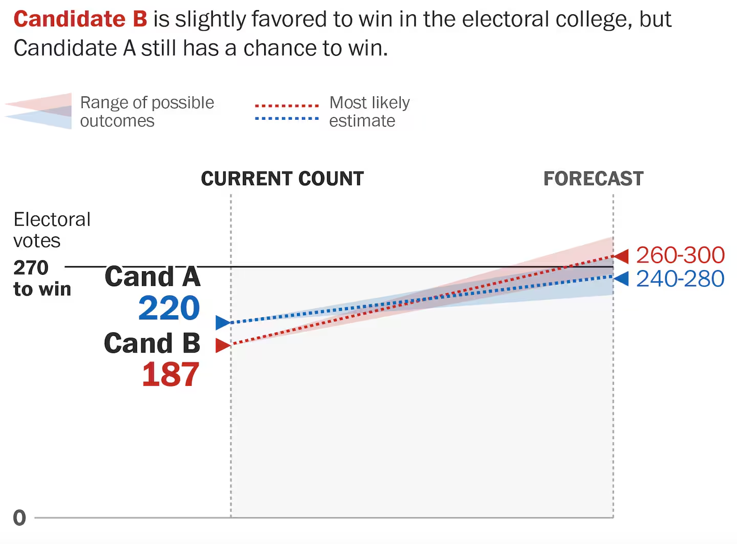
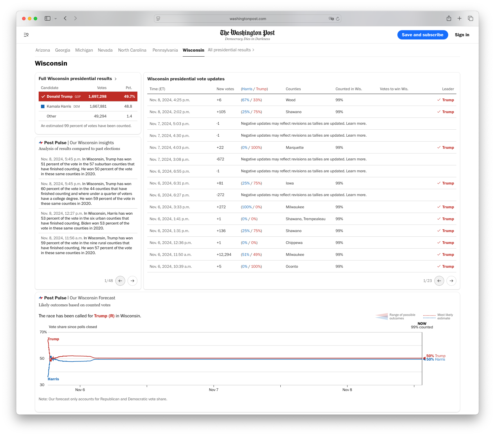
One of the challenges when it comes to reporting real-time elections data is that there are many idiosyncrasies with how the vote gets counted that require some careful consideration and design in order to give readers the correct understanding of how to interpret the results. For instance, voting results reported live on election night represents the votes that have been counted first. Some states might count rural votes first, while others states might count mail-in votes last. These details are often reflected in early patterns based on how a state processes the vote count logistically, meaning that final results often look very different from early results. To properly capture this phenomenon, our team came up with the Post Pulse, a way to capture currently counted results in the context of how we expect the vote to end up.
Another very important piece of elections coverage is all the automated text around the pages that are often overlooked. Despite using many charts and graphs to visualize the data, it is still crucial to use text to clearly communicate the most important takeaways from the data. Many of us elections nerds enjoy diving straight into the tables and graphs, but in user studies we are often reminded that not all users know how to easily read tables and graphs, and often need to be told how to properly interpret the data. We call this robotext, and while robotext seems like a simple text template, a significant amount of time is spent editing and validating the logic for various scenarios that do come up.
Maps maps maps
For 2024 elections coverage, one of the things that we rebuilt on the front end was the map infrastructure. Prior to 2024, The Washington Post elections team was using a custom geospatial file format that needed to be manually generated for every single congressional district, township, county, and state, and rendered on the frontend as SVGs. Making all the maps in this custom geospatial format for the general election would have been an enormous undertaking, so instead we decided to create even more work for ourselves by rebuilding the frontend mapping infrastructure on PMTiles and MapLibreGL.js.
Utilizing some of the prior art created by the graphics team, we decided to take a similar approach. Using a combination of mapshaper and tippecanoe commands, we wrote a script to download, process, and output the PMTiles that we need for all the geographic boundaries for states, counties, districts, townships, and wards, allowing us to use MapLibreGL.js on the frontend to display and render a map based entirely on just a map config string. While this system was a lot of effort to engineer, test, and deploy, it also proved to be much more performant on the frontend for browsers supporting WebGL.
A firehose for those that want to drink
The elections dashboard, or what we refer to internally as “the firehose” is a brand-new product our team devised for the 2024 general election. The dashboard serves as a tool for elections data nerds to be able to see the details of every single vote update as it comes in, conveniently showing the “hurdle”, or the percentage of votes the trailing candidate needs in order to catch up with the leading candidate at every update.
Components for the rest of the site
Besides elections results pages and the firehose, live elections results were also displayed on the homepage, the live updates feed, and the mobile apps. To support this, we created a system for live election components that could be embedded anywhere, enabling our editors to be more creative and provide charts, tables, and maps across the website. Another highly visible piece of web real-estate that we took over for the general election was adding a subnav to all pages across the Washington Post. The Subnav drove traffic from around the site to our elections results pages. And for iOS users, we implemented a live activity for iOS that allowed users to keep track of the presidential balance of power from their lock screens.
Looking forward
I've glossed over a lot of details and other tasks that made the 2024 such a huge success for the Washington Post, and I've also taken almost exactly a year to finally publish this piece, but even a year later I often think back on this project as one of the most impactful things I've ever had the honor of taking a part in. I decided recently that I should document as much as I can as the details slowly start to fade from my memory, but I doubt I'll ever get over my hatred of the ridiculousness of the American election system, probably to wake up from nightmares of fighting Maine township data for the rest of my life.