Data Journalism and the Digital News Era
What is data journalism, and what role does it play in the future of the news industry?

By any honest reflection, journalism is a messy endeavor. It’s often a mad rush to publish while accounting for the demands of our sources, readers, and editors, creating an environment where being fever-pitched is more of a norm rather than an exception. Even in my corner of the newsroom doing data and graphics for news stories, the time constraints while collecting, transforming, analyzing, visualizing, editing, and optimizing digitally-interactive reporting leaves no time for pontification. No matter how restrictive these constraints are, I also find that some of the most creative and rewarding projects come out of this difficult and challenging environment.
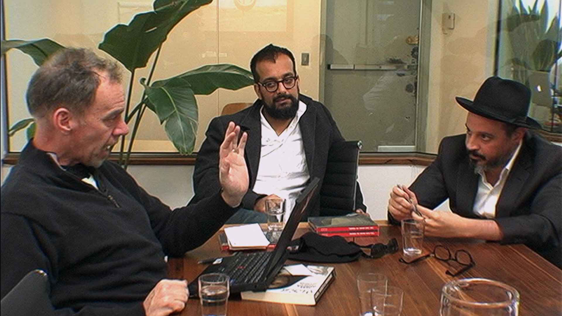
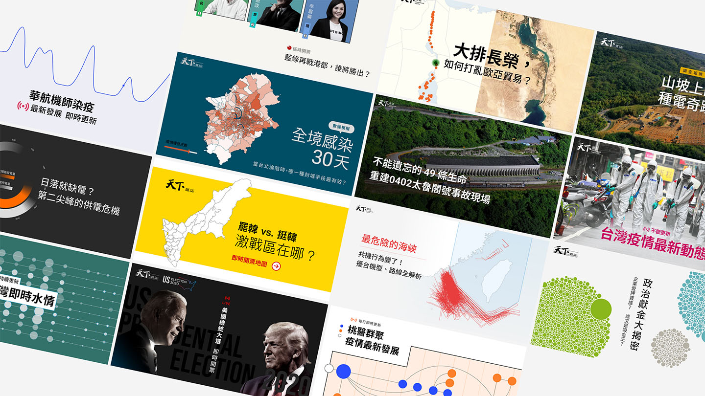
In 2021 alone, I’ve worked with an extremely talented, cross-functional team to do everything from 3D recreations of news events to digital cartography to live elections, COVID, and drought trackers in the form of breaking news and investigative journalism. We’ve had to use a non-trivial amount of software tools, open source libraries, and browser APIs, many for the first time. But no matter how much we improve our practice, there is always more to learn and new techniques to use. Being in the rapid development and publish cycle of a newsroom gives us the perfect environment to try all of these new tools and technologies in creative ways.
In 2021, we’ve also received significant recognition for our projects, winning news awards and sharing our experiences with students and faculty at universities across Taiwan. The lessons and ideas discussed in this post are an adaptation of the talks I’ve given and feedback I’ve received in the past year at universities and other venues.
Data Visualization
But before I get to data visualization and graphics in a journalism context, I want to explore both data visualization and journalism separately, as many of our practices in data journalism are influenced by the broader context of the history as well as the current state of data, technology, and journalism. Many other industries have their own manifestations of data analysts and data visualizations, often using a very different set of tools and procedures than the ones we use in the newsroom.
Florence Nightingale
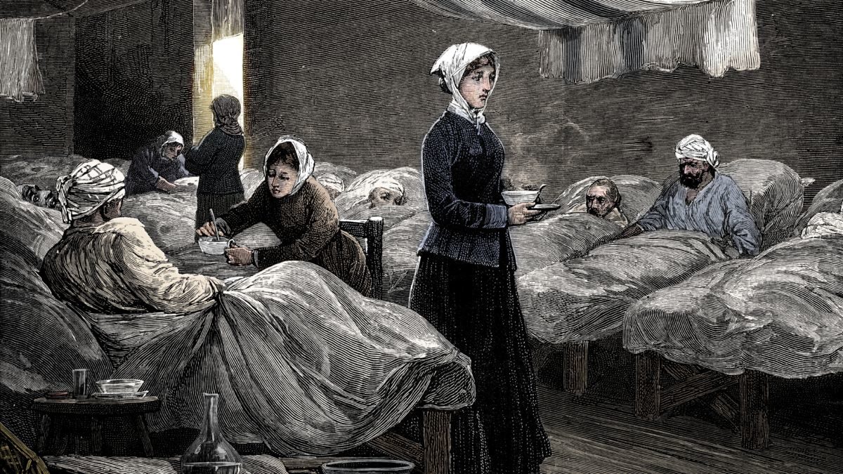
One of the earliest recorded examples of data visualization comes from the 1860s. Florence Nightingale, often referred to as the “founder of modern nursing”, is more often recognized for her contributions to medicine and sanitation, but Nightingale was also a statistician, social reformer, and writer.
During the Crimean War, Nightingale took care of wounded soldiers and collected data on the situation in hospitals including death rates, sanitary conditions, and more. With this data, Nightingale eschewed the standard practice of simply printing the data on a table and visualized the situation in a revolutionary new way at the time: a radial pie chart.
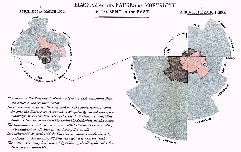
Doing so caught the attention of both fans and critics, but as a result of Nightingale’s research and publication, nursing made significant advancement toward the understanding of sanitation in healthcare, significantly reducing the mortality rate of wounded soldiers. In fact, this research would also provide grounds for improving sewage and sanitation in private homes, leading the way for significantly improved public health and sanitation. Nightingale’s work is inspiring not only because of the new visualization techniques she created, but also the impact she had on so many lives as a result of her research and publication methods.
As We May Think
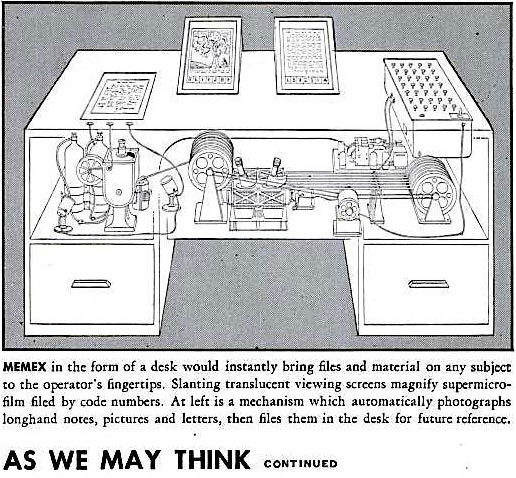
In 1945, The Atlantic published “As We May Think” by Vannevar Bush, an American engineer with dreams for "a future device for individual use ... a sort of mechanized private file and library.” Bush called this conceptual device a “Memex” and goes on to describe in rough terms the internet-connected computers and mobile devices that everyone uses today.
“Logic can become enormously difficult, and it would undoubtedly be well to produce more assurance in its use. The machines for higher analysis have usually been equation solvers. Ideas are beginning to appear for equation transformers, which will rearrange the relationship expressed by an equation in accordance with strict and rather advanced logic. Progress is inhibited by the exceedingly crude way in which mathematicians express their relationships.”
Bush envisioned a future where these “memex” devices would significantly reduce the trivial limitations of physical mediums to help humans think in ways more conducive to conducting research, inventing new technologies, and living healthily. Bush envisioned much of the “information society” that we find ourselves in today, and took the optimistic view that such a society would be able to better solve scientific problems and understand history.
Yet in other ways, the digital mediums we use today for data visualization are nowhere near the utopia that Bush dreamed of. Bret Victor talks about the still-unrealized potential that our media has on helping us think thoughts that would be otherwise unthinkable, and from a bird’s eye view is the big overarching challenge to everyone who does data visualization. Giorgia Lupi, an information designer that has spent a lot of time working to humanize data, talks about this challenge in a very poignant way.
“We have to find new languages, and explore how to convey knowledge and inspire feelings simultaneously with data. We have to discover how to be faithful to scientific accuracy while allowing space for exceptions to flourish. We have to bring data to life—human life.”
D3 and the Web
That brings me to our modern era of data visualization on the web. In 2011, Mike Bostock released D3, an open source library for creating graphics on the web. While D3 wasn’t the first data visualization library to be created for web browsers, it’s low-level approach and direct manipulation of the document object model (DOM) in web browsers allowed it to be incredibly flexible and adaptable to any kind of chart authors wanted to create.
Linking data directly with the low-level building blocks of the DOM unlocked a huge range of user interactions and visual animation. Compared to other programming languages used for data analysis such as Python or R, Javascript suddenly became an increasingly viable and attractive tool for data visualization because of its integration with web browsers and their native APIs such as HTML, CSS, and SVG. Since then, the Javascript ecosystem has exploded with tools and libraries for data visualization, including everything from managed services such as Datawrapper and Tableau to GPU-accelerated tools such as P5 and Regl to 3D tools such as Three.js and so much more.
Additionally, web cartography has also experienced a renaissance of sorts. Google Earth and Google Maps, two of the most established consumer digital cartography products in the internet era, have become increasingly similar as web browsers have become powerful enough to run the features that would previously only run on standalone applications such as Google Earth. The possibilities for creating complex, geographically detailed, or interactive data explorations accessible to anyone with a web browser would have been unfathomable when D3 first launched in 2011.
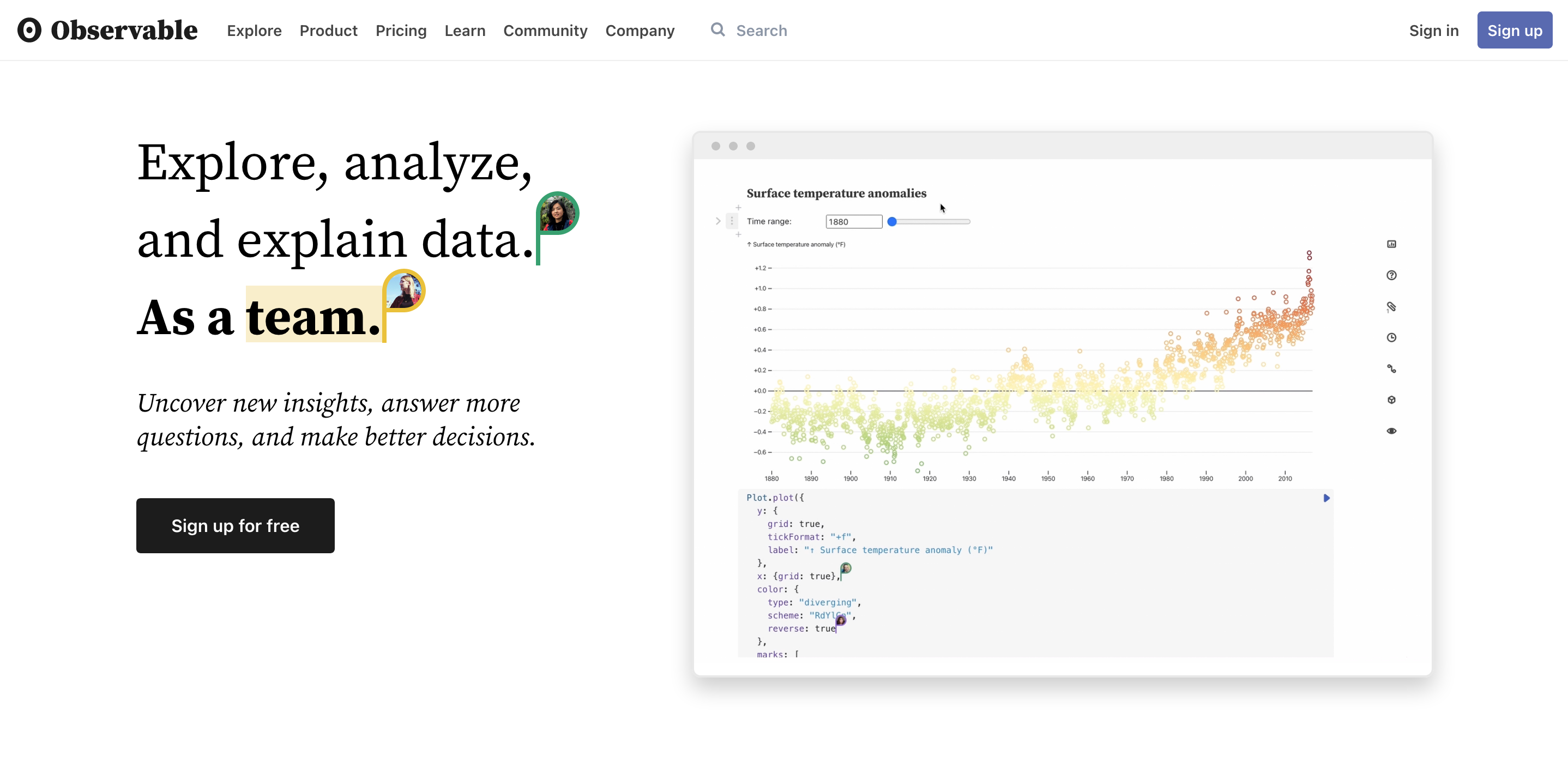
Today, Bostock is working full-time on Observable: an environment for collaborative, visual, and explanatory notebooks that run locally in the browser. The ability to browse, remix, and adapt notebooks other people have written has given individuals learning to do data visualization an easy way to publish standalone graphics and interactives. Tools like Observable are an example of the ways that web browsers continue to evolve to support new features, even if they are incremental improvements on existing technologies, rather than hype-fueled fads.
Journalism
When it comes to newsrooms, however, the transition into the digital era has not been at all smooth. In the late 2000s, a wave of digitally-native platforms arose in competition to the long-standing industry of established newspapers and magazines, followed by another wave of social media startups awakening to monetize the attention of internet users, eating away both both the discovery channels and advertising revenue of the existing media industry.
Tech companies, media leaders, advertising companies, and internet users all had—and still have, competing visions of what journalism on the internet should look like. Vice News, one manifestation of digital-native news organizations, took a very raw and borderline sensational approach to telling stories. David Carr, the former media critic at The New York Times, wrote in his column his observations about Vice News.
“The company has grown to 560 employees in 30 countries, with 2,500 freelancers who are mostly paid in hipster cred. This success has created some dissonance for a crew of raconteurs who have spent much of their lives laughing at the stiffs who live pointless lives in dumb jobs defined by their next PowerPoint presentations.”
Beneath the past two decades of media debates and debacles has ultimately been the loss of trust in media. Sensational clickbait headlines, deceptive subscription packages, partisan politicization, fake news, poor user experience, lack of cultural, gender, or racial sensitivity, sponsored content, have all contributed to the precipitous drop in the public’s journalistic trust.
The Kerner Commission, 50 Years Later

While most of these are not unique to the internet era, the internet era has made a lot of these problems a lot more apparent. Back in 1968, the Kerner Commission surfaced all sorts of racial injustices, including the media industry’s lack of diversity for the racial riots happening in America. Reading a report from over fifty years ago reveals how little has changed, and how many of its criticisms still ring true today.
“the press has too long basked in a white world looking out of it, if at all, with white men’s eyes and white perspective. That is no longer good enough. The painful process of readjustment that is required of the American news media must begin now.”
There often is a real disconnect between the lofty ideals espoused by media executives and the realities of the work being done. They tell you “Journalism is what we need to make democracy work” or “News organizations hold truth to power”, but fail to hire and retain a diverse workforce themselves. Even some of the most high-profile instances in recent years have showcased the conflicts between news executives and their workforces, such as The New York Times using shady strategies to prevent their technologists from unionizing.
This is in addition to all the challenges that news organizations have in finding and retaining diverse talent. In an exit interview with Source, Aaron Williams talks about the artificial ceiling he experienced as a data journalist, and even the shame he felt when he left The Washington Post for a job at Netflix.
“Being labelled a ‘digital’ journalist felt like death knell to my future career aspirations. I spent large parts of my career convincing editors I was a journalist, full stop, and that the data and design aspects of my skill set aided in that endeavor.”
Of course, journalism isn’t the only industry challenged by instances of poor management and unhealthy work cultures. However, the role of the news industry in our modern society and the lofty values espoused as a check on power lends the news industry to a higher standard and far more scrutiny, in ways that news organization need to approach with transparency and leadership. Some of the harshest scrutiny of news organizations can be found on social media, another deeply integral phenomenon of our digital era.
Social Media and SEO
Social media has, on one hand, become vital distribution channel for news organizations, but on the other hand, left news organizations at the mercy of opaque social media algorithms whose sole purpose is to maximize engagement. When social media platforms announced a “pivot to video” in 2015, news organizations had little choice but to follow along, forced to accept what later was revealed to be fake viewership metrics just to appease advertisers.
Even today, the relationship between social media platforms and news organizations remains tenuous at best. Also launched in 2015, Facebook Instant Articles is a way for Facebook to collaborate with publishers, allowing news articles to be easily and efficiently readable directly on Facebook without users ever having to leave the app or the website. Much like Facebook's push for video, instant articles has been largely abandoned, due to the lack of results and loss of control for publishers.
Search engines, in a similar vein, have also attempted to strong-arm publishers into playing by their rules. Google released Accelerated Mobile Pages (AMP) in 2015 promising a better and faster experience for mobile users by using a customized set of amp-compatible HTML. And while AMP did in fact improve page-load times for many news articles, AMP also had scandals such as throttling non-AMP ads in order to promote AMP. And as search engine optimization has taken off as its own sub-industry under marketing departments, search engine results are quickly becoming a listing of who has money to hire SEO specialists rather than who actually has the best content.
The Challenge Inside Newsrooms

One of the largest shifts within newsrooms, however, has been the diversification of roles and responsibilities, no longer comprised of only the journalists, editors, and photographers of yesteryear. Today, newsrooms include roles such as podcasters, video editors, project managers, designers, software engineers, cartographers, data scientists, and so many more. The scope of an entire news product has ballooned far beyond what any single person or leadership unit can possibly grasp.
This means that traditional, hierarchical management structures are ill-suited to adapt to the complexities and challenges of the modern digital journalism, especially if a newsroom has aspirations of publishing across a diversity of print, video, audio, and digital formats. The New York Times' 2020 Report talks about this challenge.
“We need to become more comfortable with our photographers, videographers and graphics editors playing the primary role covering some stories, rather than a secondary role.”
According to the recently released State of Data Journalism Survey conducted by the European Journalism Centre, most data journalists are still siloed in their own “data units”, with infrequent collaboration with other people in their newsrooms. Journalists are unsure how to work with technologists, often creating an environment where different factions form within newsroom, rather than playing on a diversity of skills and approaches in telling stories.
The Future of Data and Visual Journalism
With ever-advancing digital mediums and all the challenges facing journalism, there is a significant opportunity to rethink our relationship with news, especially given the world of data that we live in. From a data and technology perspective, there has never been a better time to do journalism, only limited by how we adapt and use more data and technology in our reporting. This is not to say we ignore the lessons of the previous era of physical media, but rather how we build upon the lessons of the past using the tools of the present, in close collaboration with traditional journalists and editors.
Over the past two years, we’ve seen the COVID-19 story create a whole new class of long-lived data journalism projects that have challenged the traditional notion of what a story is. How a project gets updated, edited, and shared has now become an important consideration for large-scale projects that aim to help readers understand a situation. This model can be extended to other areas to help the public better understand nuances of natural phenomena, government policies, social phenomena, climate change, economic cycles, and so much more.
This is an exciting shift in journalism because it helps organizations report news beyond units of stories or articles, allowing news organizations to better capture and track long-running stories and trends. Another benefit of doing so is helping readers become more familiar with data-driven approaches, allowing interactive visualizations to serve both explanatory and exploratory roles.
Big Macs and Open Data
The Big Mac Index by The Economist is also a great example of this kind of long-running data journalism project. Invented in 1986 as a “lighthearted guide to whether currencies are at their ‘correct’ level”, the Big Mac Index has been quoted in numerous academic studies due to how easy it is to understand and digest. Additionally, the data behind the Big Mac Index, is available on Github under an open source MIT license, freely available for anyone to use for any purpose.
Releasing open data to the public is another way of sharing stories in our digital society. News organizations have the opportunity to not only look for data to tell stories with, but also the opportunity to be contributors of data. A few examples of this include The Washington Post releasing data on police shootings in the US, The New York Times making COVID datasets public, or ProPublica’s Congress API.
I believe that, if done responsibly, data journalism can play a significant role in helping restore the public’s trust in media. By making data public and contributing to the world of open data, news organizations can also help bolster public trust, transparency, and data literacy. Despite the fact that only a small subset of readers may download the data themselves, releasing data ultimately allows for greater accountability within the stories we are reporting on.
The Digital Newsroom
This is not to say that visual, web-based journalism is the only innovation happening in the journalistic sense. Podcasts are reaching audiences that traditional words and pictures have been unable to reach, creating a whole new segment and conventions around telling stories through audio. Online video journalism, despite Facebook’s “pivot to video” scam of last decade, is still a viable and growing area. There are synergies yet to be explored between all of these differing mediums of journalism and fully realized in reporting.
Experimentation, prototyping, and rapid feedback loops are vital parts of successful digital newsrooms. Just as journalists must often adapt to the specific circumstances of a political system, industry, or environment in order to properly and ethically report on it, newsrooms must learn to be flexible enough to adapt to the trends in technology and readership in order to better tell stories. Mediums such as virtual or augmented reality, video games, social media, are all potential areas to be carefully considered and experimented with in future iterations of news products.
In conclusion, it’s easy to become infatuated with the pace new technologies are being developed and deployed, but news organizations need to remain focused on their north star of telling stories that matter using data, visuals, or other multimedia when it strengthens stories. News organizations have the opportunity to play a larger role in making data more accessible and transparent to the public, while simultaneously working to improve data literacy as much as possible. It’s a challenge that will continue to be messy and challenging to manage, but I believe that newsrooms can continue to be vital institutions of leadership and innovation.