Building a Realtime Election Tracker
On January 11th, 2020, Taiwan went to the polls to elect their next President and Legislature. For us at the News Lens, we formed a small team of designers, engineers, and editors to build this year’s election tracker.
On January 11th, 2020, Taiwan went to the polls to elect their next President and Legislature. In Taiwan’s short history as a democracy, this election was only the 7th presidential election that Taiwan has held, conducted after months of unrest in Hong Kong and an increasing trend of populism around the world. For us at the News Lens, we formed a small team of designers, engineers, and editors to build this year’s election tracker.
Product
Before we started planning the technical details, we began by thinking about election coverage as a product: What do readers care about? What are their reading habits / usage patterns? Who is our audience?
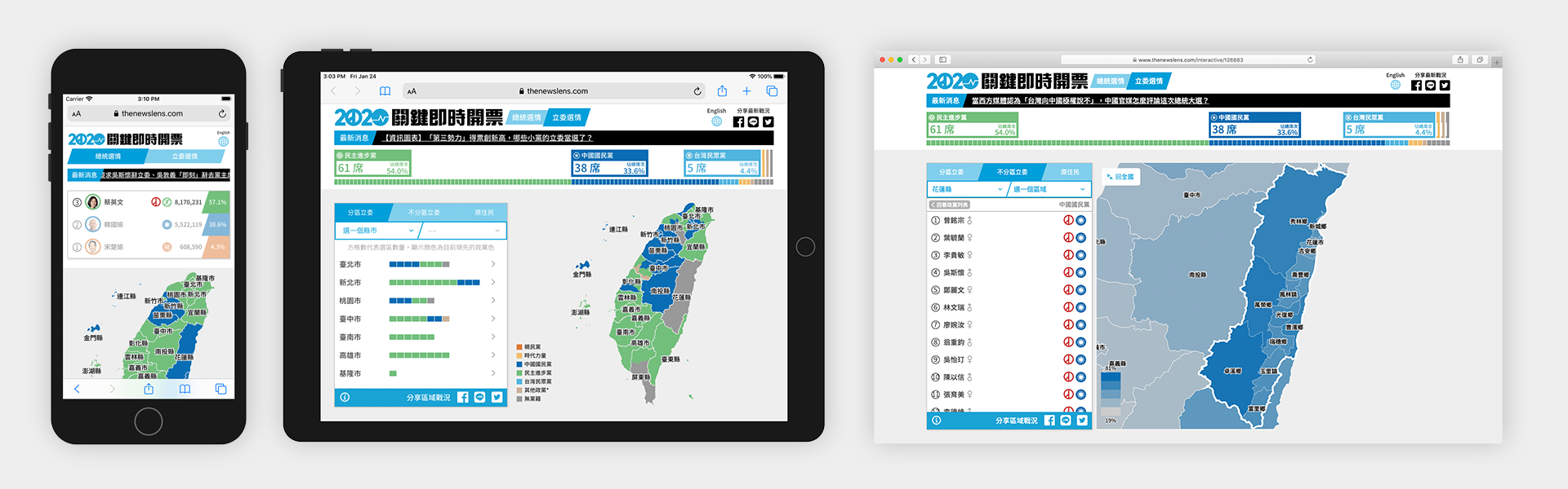
For starters, we expected that 80% of our readers would be accessing our content from a mobile device, and the large majority would be looking for Chinese content, although we would also make a version for our English readers. We knew that we wanted to display the results as close to realtime as we possible could, and knew that we wanted to cover presidential, district legislators, party legislators, and indigenous legislators. We also knew that we wanted to create an experience that gave readers content for before, during, and after the election, and to make content that could be built upon and referenced in the future.
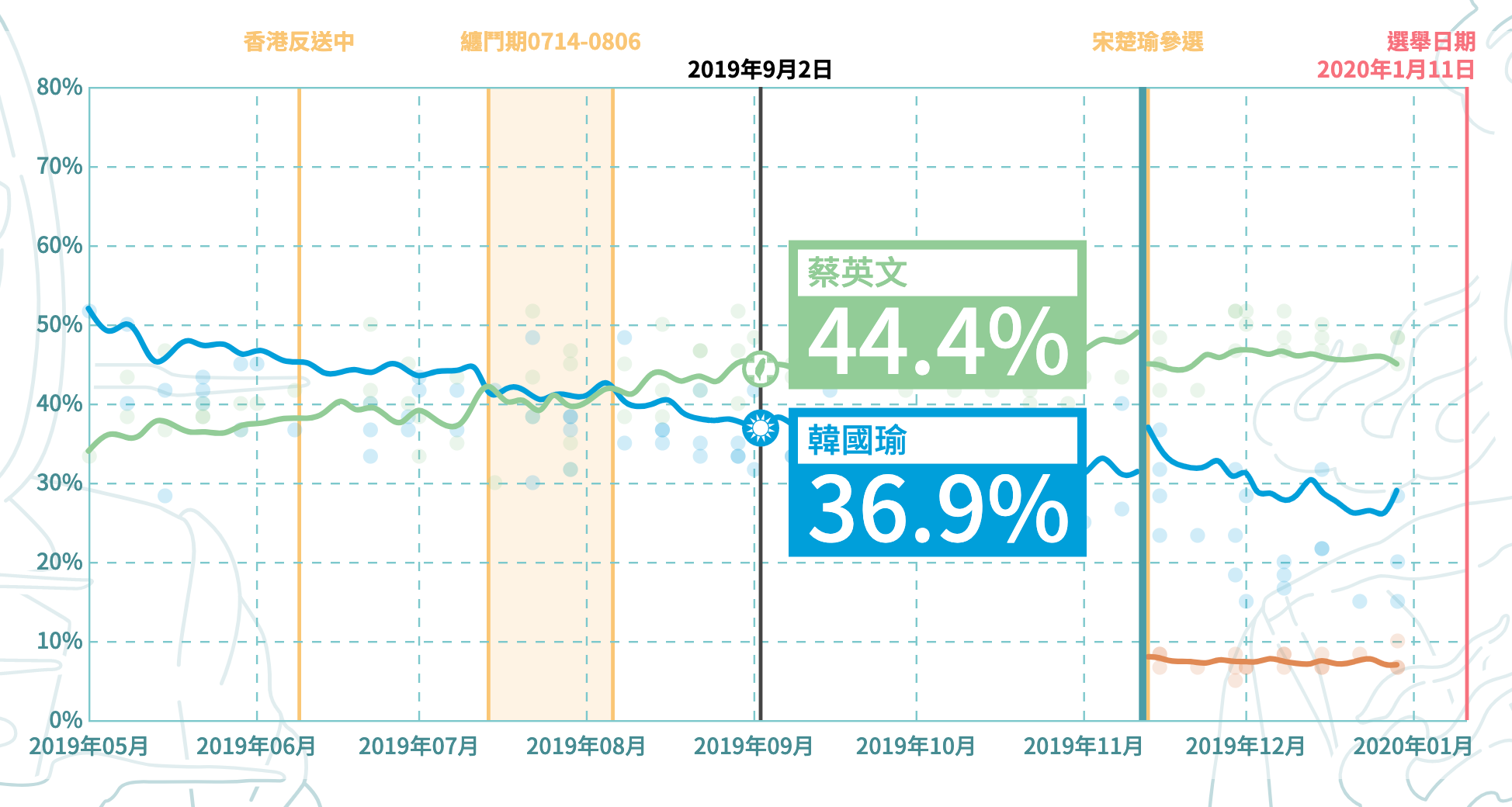
To begin, we launched our election coverage by doing an aggregation of political polls in Taiwan, giving readers a more holistic view of trends of support for each of the presidential candidates. This not only gave us a way to promote our election coverage, but also gave us a way to test our new, Svelte-based system for building interactive articles and work out some of the kinks before election day. In total, building this tracker took us about two months, with a dedicated engineer and designer working nearly full time on this project.
Maps
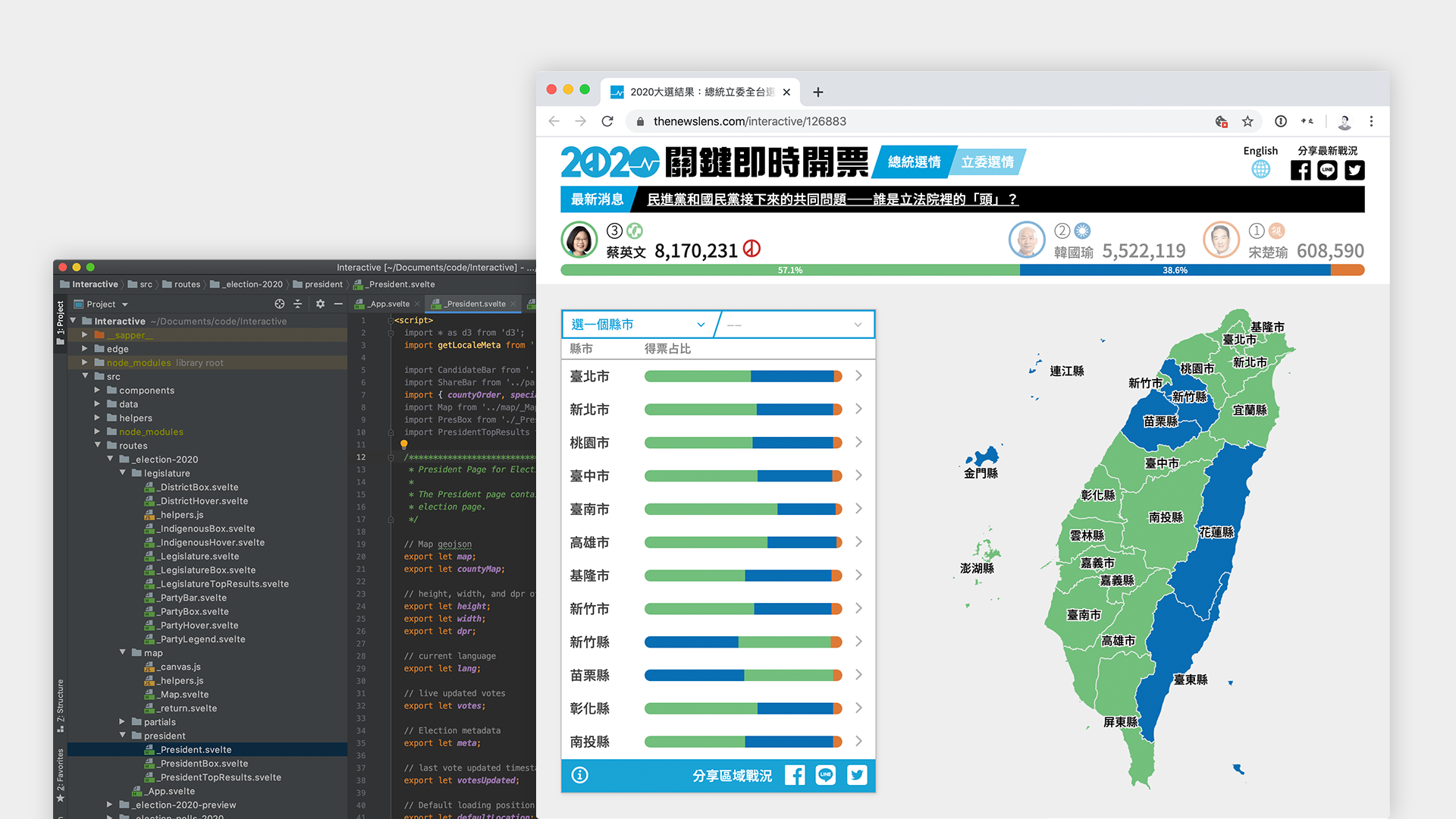
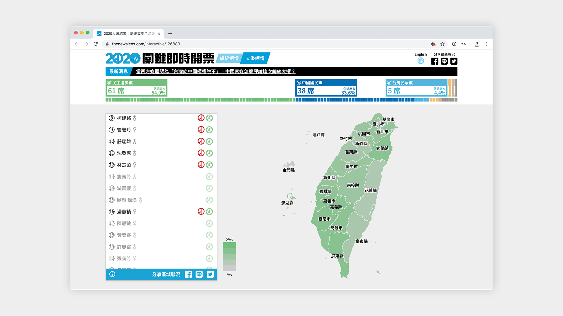
Given that the main interaction users make with the election tracker is through the map, the map had to be responsive to user interaction and data updates. To allow users to explore as much of the data as possible, we decided that our map would at have three different layers to interact with.
The topmost layer is the whole country, including the outer islands that are part of Taiwan’s jurisdiction, followed by 22 counties (縣市). Each of the 22 counties can be further divided into towns (鄉鎮區), and the smallest unit of locality which we did not display is the village (里).
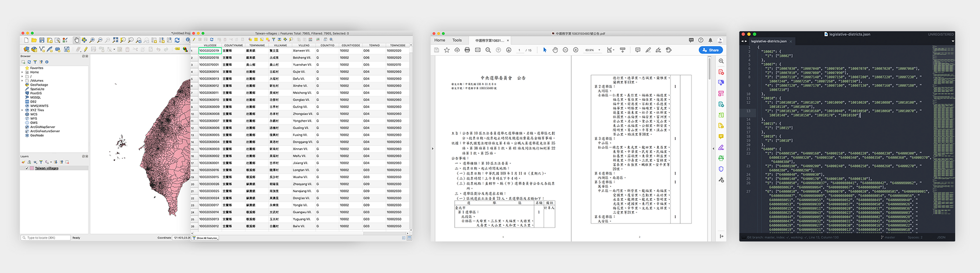
All of this map data is obtained from Taiwan’s government website in the form of a 114MB shapefile. Obviously, if we were to directly convert the shapefile to topojson (a format for browsers to draw maps, more on this later), we’d still be looking at a file that is ~90MB in size; far too big to have every user download to their device.
Moreover, the map needs to be processed for special areas (areas that are part of Taiwan’s jurisdiction but may not be part of an official locality, such as 釣魚台) and relocation of the outer islands so that Kinmen and Lienchiang don’t make the map look too big. At first, I processed a few topojson files using QGIS and the shapefile obtained from the government, but after many failed attempts, (ie incorrect island relocation, missing districts, resulting file too large, too many details removed from the map during compression, etc) I decided to create an API endpoint that would process the map that I want on the fly.
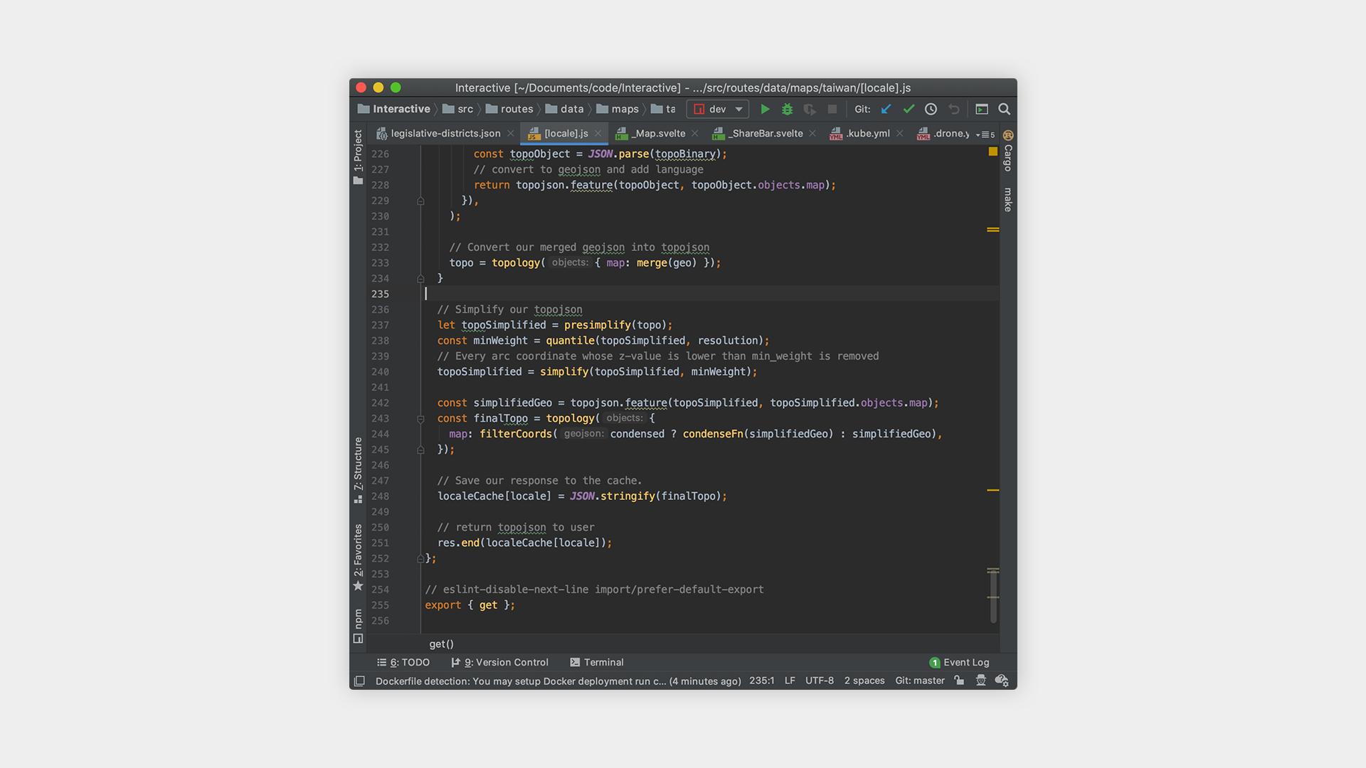
In essence, the API endpoint takes a few parameters:
- Map Version: Due to the fact that these borders will change based on redistricting or otherwise, I wanted to future-proof this API by allowing future maps to be easily versioned by year.
- Locality Depth: Do we want the borders of the county, town, village, or district?
- Specific Locality: Do we want the borders of a specific county, town, village, or district?
- Simplification Level: How simplified do we want the resulting JSON file to be? More simplification and quantization means smaller file sizes but also a loss of detail.
- Condensation of Outer Islands: Do we want a map where Kinmen and Lienchiang are where they are geographically or do we want to see them closer to mainland Taiwan?
However, because legislative districts are not exactly correlated to any one of the existing locales, we had to separately process all of the locales of each of the legislative districts. Because a whole day of searching could not turn up a shapefile for Taiwan’s legislative districts, we decided to create the map ourselves based on which counties, towns, or villages, belonged to which district.
SVG vs Canvas
After constructing a reliable way to generate our topojson, the next question was figuring out how to display it in our browser. The naive approach is to simply render the topojson to a SVG. However, the problem with this is that SVGs use the DOM, which means that changes or user interactions with a complex SVG is slow and resource intensive. Add locale labels and mouse interactions and suddenly your SVG implementation slows to a crawl.
The alternative is to use a canvas for display and an invisible SVG for interaction. This allows us to avoid expensive DOM operations of maintaining and manipulating the color of each locale on the map and instead use the canvas API to paint our map, while maintaining a SVG just to keep track of when users interact. In my very unscientific benchmarking on my own machine, I found that SVGs needed to be about twice a simplified compared to canvas in order to achieve similar performance. More about this method here.
The optimizations that I could have done on the map are endless. If we were to further optimize the map, I would recommend using some kind of WebGL implementation, potentially MapboxGL to make map rendering performance even better, but a canvas approach was good enough for this use case.
Data Pipeline
The data for our election tracker was obtained from the Central Election Committee, which gives us a 3MB JSON file of all the data anytime it is updated. Because this JSON file is so large and can take up to 5 seconds to download from the Central Election Committee, we decided to only fetch it at a regular cadence and process / store it into a database we can control and scale.
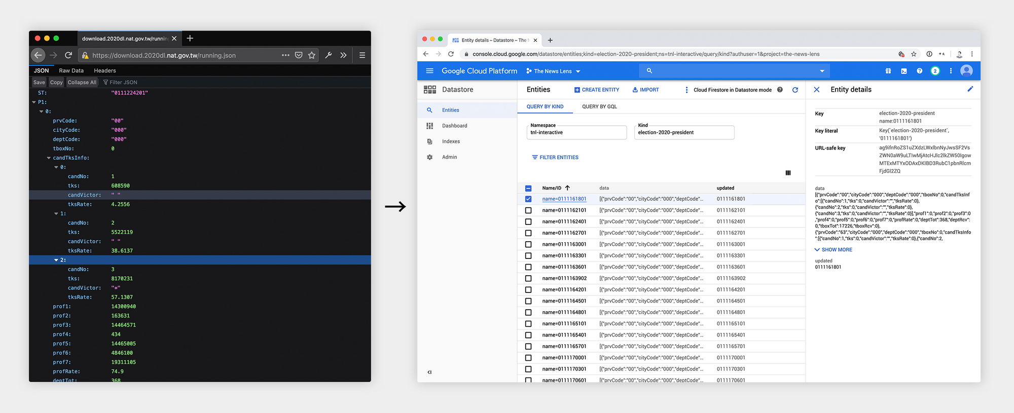
To do this, we used a cron job that would fetch the latest data from the Central Election Committee every minute, and separate out presidential and legislative results before storing it into Google Datastore.
Then, in order to indicate when a candidate has won, we connected a Google Spreadsheet that allowed our editors to manually mark when a race had been won. The system would then use that data to display the winner on the frontend. As it turns out, this became a problem on the night of the election, which I expand more on in the “lessons learned” section.
Election Rules Edge Cases
In terms of electoral rules, Taiwan follows a simple majority-wins policy for electing it’s president, which is easy to display on a map. However, legislative races follow a fairly complex system:
- Taiwan’s legislature has a total of 113 seats.
- 73 district legislators are elected through a majority-wins policy for each of the 73 designated districts of Taiwan.
- 34 party legislators are elected through a party-vote system, in which voters vote on a party, and all parties that obtain over 5% of the overall vote get to assign legislators based on the proportion of votes they receive. The legislators of a party elected through this system must be >50% female, according to the order they are ranked in their party list.
- 6 indigenous legislators are elected by two three-member constituencies, picking the top three legislators for each plains and highlands indigenous constituencies.
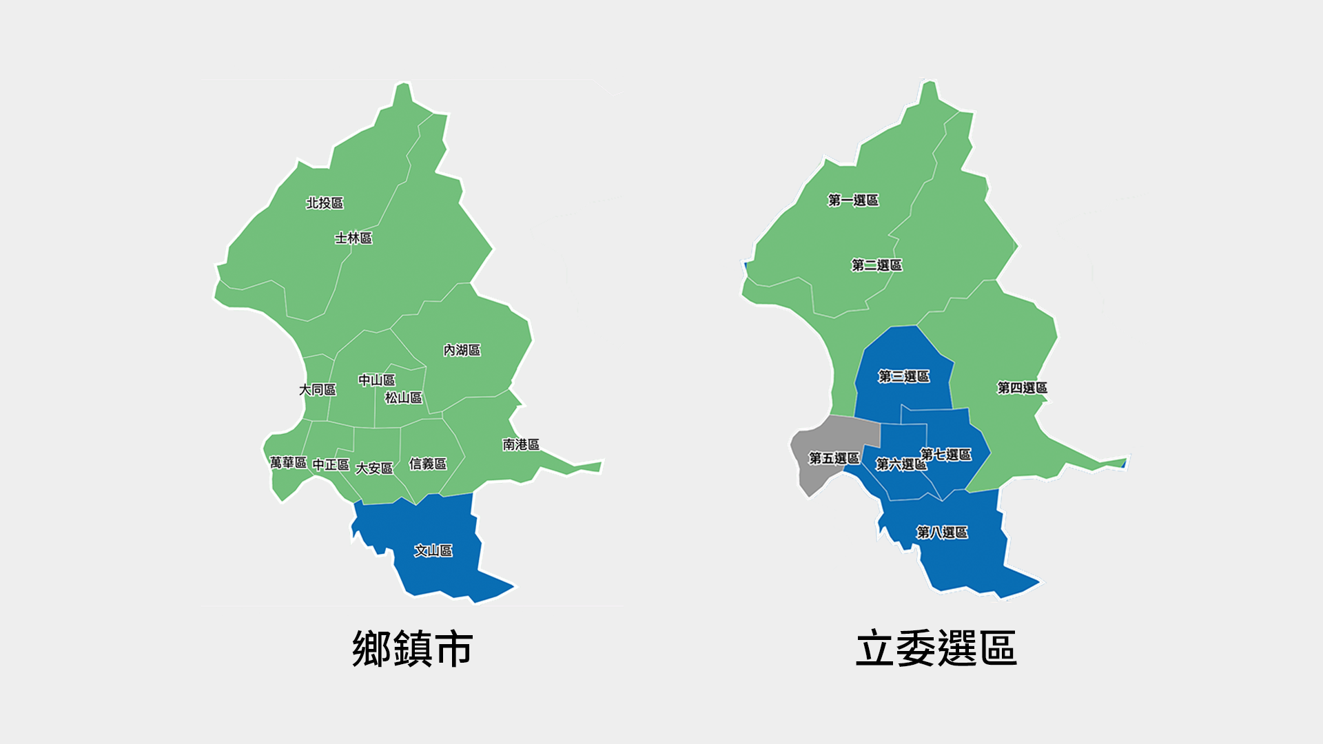
This logic poses a few challenges. First of all, the topmost level we can display for district legislators is the district itself, because we can’t calculate the color for a county that has multiple districts with different races.
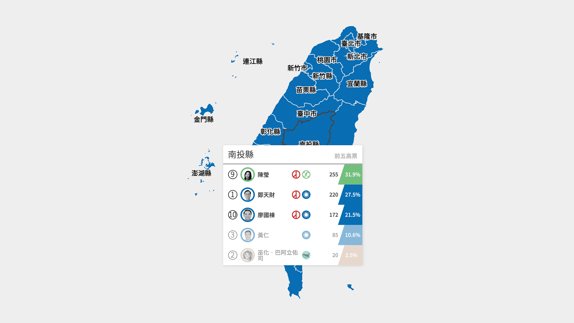
Second, because indigenous legislature races elect the top three candidates for each plains and highlands indigenous groups, simply coloring a district with the party of the first-place candidate does not reflect the true breakdown of the vote. Thus, we decided to take the top three candidates and add up the votes based on their political parties, then take the color of the party with the most votes.
Third, because of the gender rule for party votes, legislators of a party that get elected through this method do not necessarily correspond with the order that they are placed in the party list. As a result, we have to build an algorithm to determine skip over the next male legislator in the list if there are already too many men.
Post-Election Graphics
Another large element of our election coverage was the graphics that we post to social media such as Facebook and Instagram. Because we wanted to be able to generate social media optimized graphics as fast as possible, we needed a method faster than designers plugging in election results into graphic. To achieve this, we built an internal website that would dynamically generate SVGs with the latest data from the Central Election Committee.
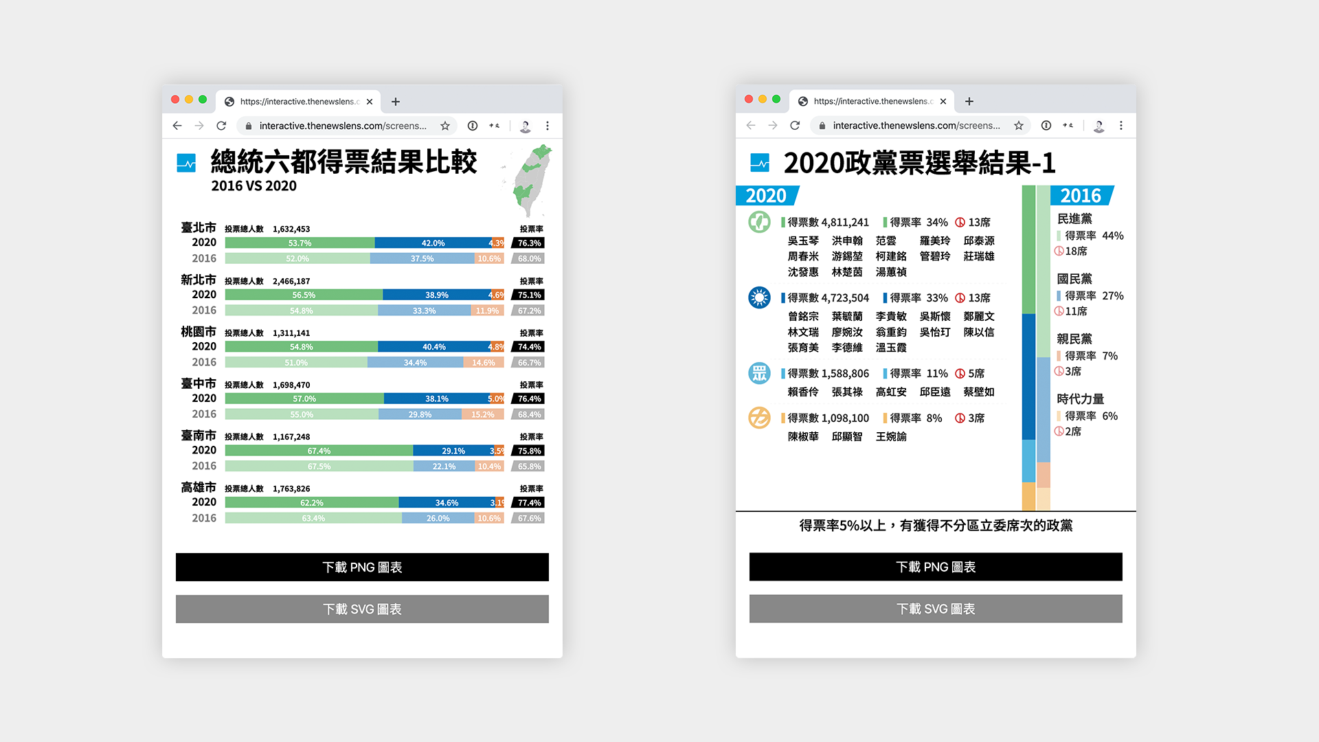
To achieve this, designers would first come up with the design of the graphics in the form of an adobe illustrator document. Then we took those graphics and exported each one into a separate SVG. Because SVG files are a XML-based specification, we can port these into our web application in order to make content within the SVG dynamic.
The great thing about using SVGs in this way is that it is language and tool agnostic, which means you can use whatever existing templating language / framework you use to generate these graphics. In our case, we fitted it into an internal website that the social media team can directly access to download the generated SVG or a PNG format to be posted on social media platforms like Facebook and Instagram.
Monitoring
Another critical piece of election-preparedness was making sure that we knew everything that was happening with our web application at all times. To monitor the health of the application and make sure that everything scaled properly, we set up a grafana dashboard that kept track of server errors, response latency, upstream API connections, cache hit ratios, as well as the standard CPU, memory, and database metrics.
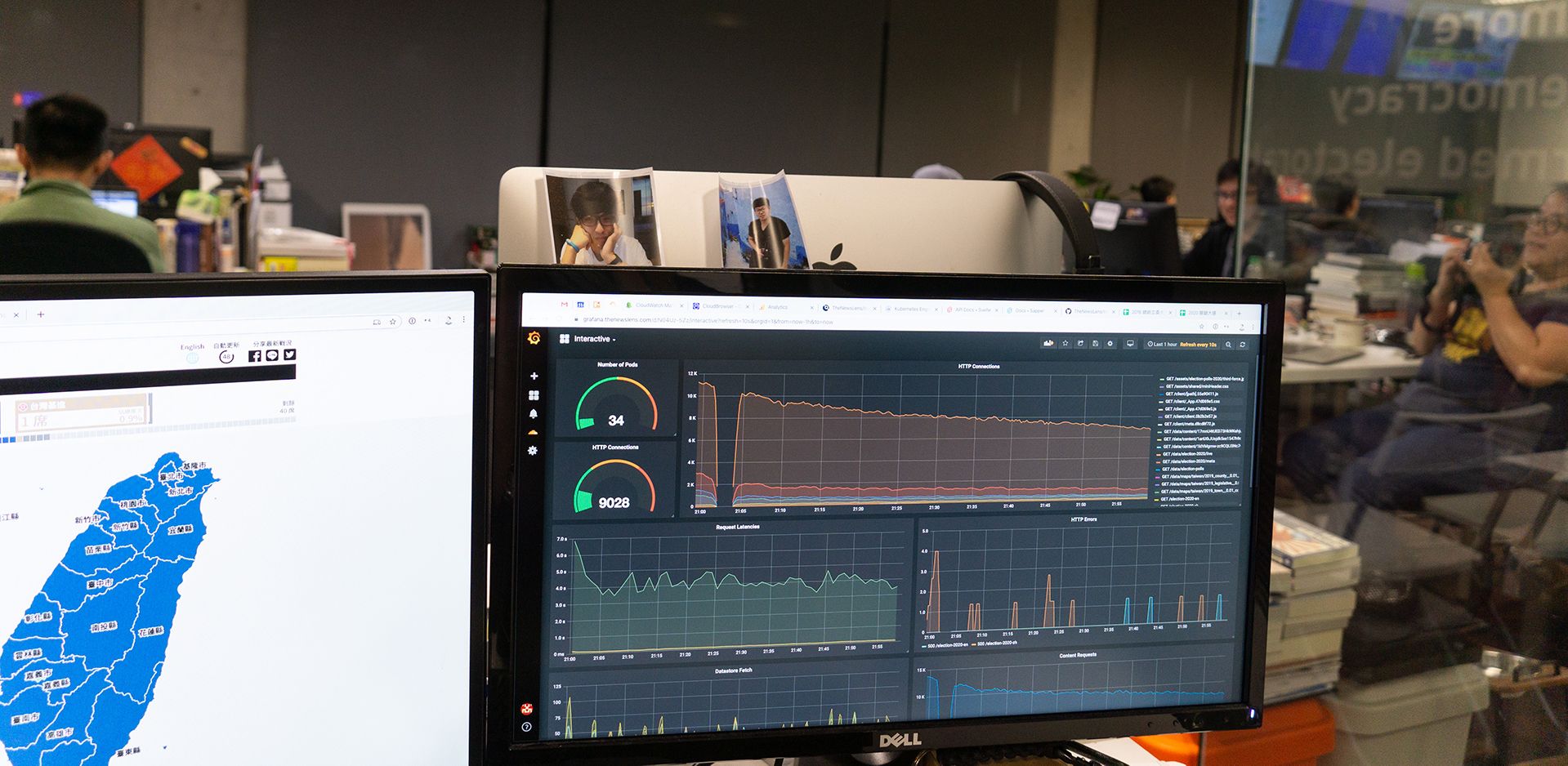
By having the web application directly report metrics to prometheus, it was much easier to get the fine grained metrics specific to elections that we cared about. Because we had taken the time to integrate key metrics into prometheus, when errors began to show up during the election, we were able to immediately know what was causing the error.
Svelte
Although React has been possibly the most popular front-end framework to use these days, one of the questions I find interesting to ask during interviews is “Under what circumstances is React not a good framework to use? When would you recommend not using React?” This is a question that stumps many less-experienced engineers and people without a good grasp of what React really does in the browser under the hood. In fact, I believe that there are many situations under which React is not a good choice, and building interactives in a news environment is one of them.

News organizations have a very different development and deployment cycle than tech companies do, requiring tighter deadlines, faster feedback loops, and more bespoke flexibility. Thus, I decided to use Svelte, giving us the following main advantages among many:
- Development speed: Given the amount of work to be done within a short amount of time, I decided that Svelte would be much faster to write than React, giving faster development and feedback times. Using Sapper with Svelte would also allow me to write the server-side data APIs quickly and easily.
- Bundled JS Size: Because Svelte runs as a compiler, it’s able to build and include only the code that your applications needs, making the compiled bundle much smaller than a React application.
If you’re interested in learning more about Svelte, there are many tutorials to help you get started.
Lessons Learned
Load Test
The biggest problem we saw on election night was that the site was down for ~1 hour due to high traffic. Specifically, it wasn’t the servers on our end that could not take the traffic, it was our usage of Google Sheets that caused Google to lock our google spreadsheet when the flow of traffic became too large. After Google locked out requests to the spreadsheet, our system started responding to downstream users with 500 errors, causing the entire site to be inoperable.
The solution was to first disconnect the spreadsheet from our services, which brought both our service and the google spreadsheet back online. Then, we implemented a quick function that would prevent the service from requesting data from the google spreadsheet so often. This brought everything back online.
The lesson here is that, unless you fully load test your entire system before the election, you never know what problems will be caused when traffic increases by a few orders of magnitude. Often, third-party services such as Google Docs will have their own unwritten throughput and bandwidth limits.
Have a Clear Incident Response Plan
No matter how much planning you do in preparation of the big day, incidents are always likely to happen and things will never go exactly according to plan. That said, after you’ve made all the preparation you can possibly make, the next important thing to plan for is how to respond when things do not go as plan. In our case, by dividing up responsibilities we had a basic level of responsibilities when things went awry, but it would have been more advantageous to rehearse a few scenarios.
Namely, when the site goes down, it is important to define who will fix the problem and who will report the status to the rest of the team. It is hard for one person to do both, lest the person trying to fix the problem becomes bombarded with too many inquiries about the current status and is unable to concentrate on fixing the problem.
Wrapping Up
In conclusion, I hope the process we used and the lessons we learned can be built upon by the community, allowing future elections and similar events to be faster, more efficient, and better experiences for our readers and our organizations. I’m sure that our processes will continue to evolve, and I hope we can continue to learn better workflows and collaboration processes.